




In 2021 CI MA studio started its research. Starting from Bologna, we develope a continuous exploration where the project is the linking elemenent between concept and constructio in the field of architecture, landscape, urbanism, craftsmanship and interior design.
As an amphibious animal lives between two different environmental conditions, always finding new challenges and teachings passing from one to the other, our activity moves between the creative epiphany and the construction concreteness. Between the recovery of the past and the surprise of new modern proposals, between strongly minimal or brutal aesthetics and decorative details.
With the continuous and daily effort of creating new spaces and scenarios, CI MA sets itself the goal of connecting worlds not always close together, thinking that from some new unions, new design solutions can be generated, as it happened by the union of CI and MA.
B . V


B . V house: red birch
“I start a project when I visit a place.”
This quote by Siza represents our design philosophy, and in particular, reflects the approach behind the project CASA B.V. In this case, the process even included the selection of the property itself (purchased with the intention of becoming our home). The trapezoidal floor plan, offering unusual perspectives, the L-shaped terrace, and the modest size but high potential for layout reconfiguration immediately gave us the sense that this was our home—or rather, our next challenge.
Right after the viewing with the real estate agent, we both already had design ideas and compositional choices in mind—ideas that persisted all the way to the construction phase: demolishing the partition between the living room and entrance to create a large and unusual open space, and exposing the concrete beams and columns.
These initial certainties became the foundation for everything else, in a design process that diverged from the usual path, with many decisions being made directly on-site.
The goal was to gain an additional bedroom compared to the existing layout (the reason we decided to move in the first place, following the birth of our daughter Dalia).
To achieve this, we made two key and unconventional choices:
-
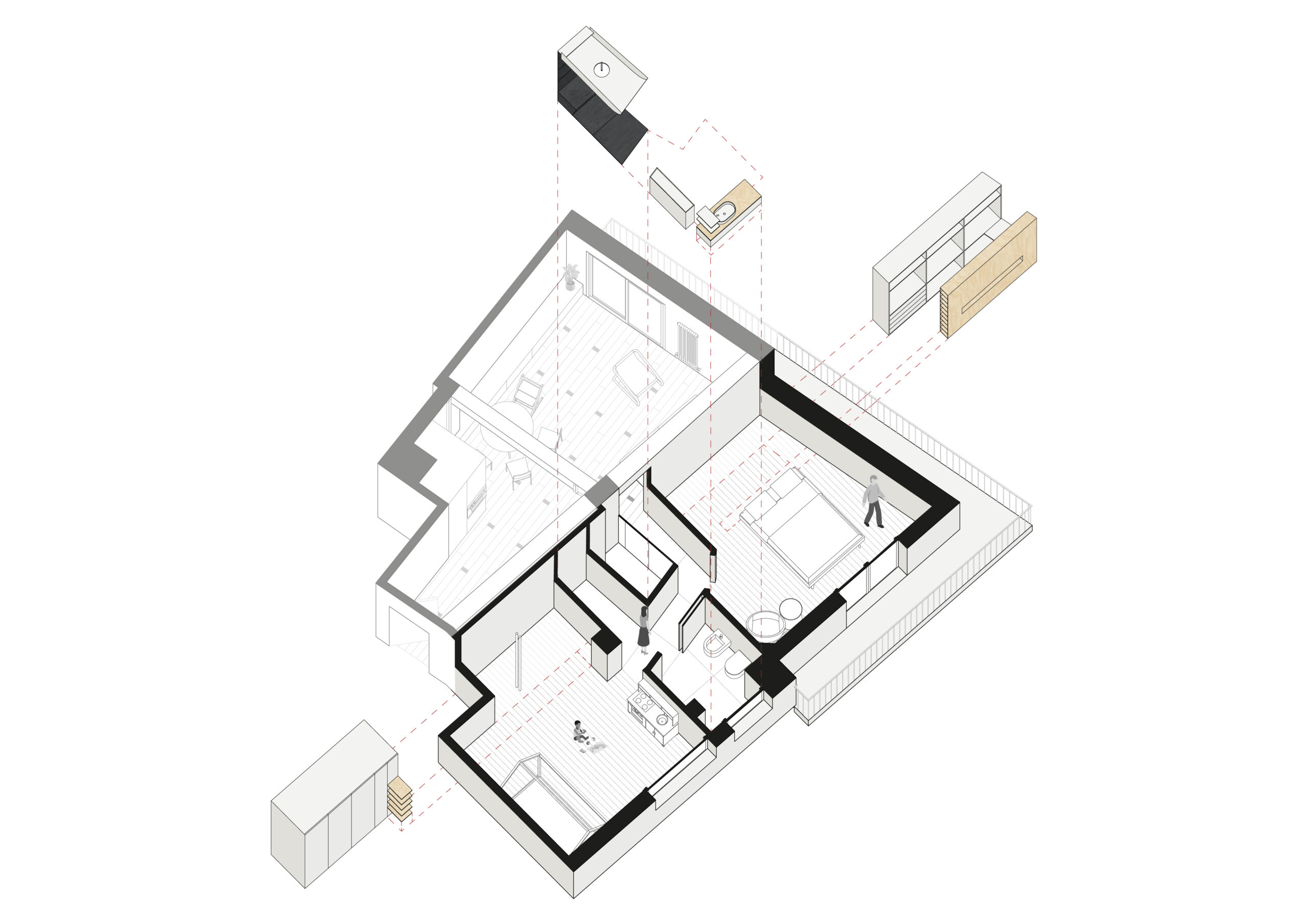
A non-linear layout for the sleeping area, separating the shower space from the rest of the bathroom.
-
The kitchen placed directly after the entrance.
The upper kitchen cabinets are aligned beneath the beam, and where the utility closet used to be, we introduced three furniture blocks serving as wardrobe, fridge, and oven column. None of the compromises typically made with private clients were accepted in this home—every choice here becomes architecture, with playful yet deliberate determination. Yes, we were radical, but with a strong sense of play, we began to enrich a minimal and clean canvas with elements full of warmth and personality.
This design direction started with the parquet flooring, used in the open space and both bedrooms. From this relatively conventional material choice, we developed unique applications. In this project, the parquet is not used to unify but to characterize individual spaces. In the living area, we chose light oak laid in a running pattern, with dark wood inlays that gently add rhythm and geometry to the space, creating visual anchors where everything else is about misalignment and surprise. If the first theme comes from the inherited spatial conditions and is an unavoidable element, the second stems from a desire to introduce playful and unexpected details—such as the use of red for all “warm” components: the radiator in the living room, the conical pendant above the table, the kitchen faucet handle, and the exposed heating pipes.
The choice to reveal the structural and constructional elements enhances the sense of spatial openness, alongside the repeated use of white and wood. Birch—a light wood full of character—emerges as a key protagonist in the project.
It first appears in the handmade recessed circular handle of the kitchen, the drawer interiors, the exposed plywood in the bench/living room furniture, becomes the countertop for the bathroom sink, and reaches its peak in the master bedroom. Here, the parquet transitions into a tatami-style floor (Fabrique by Listone Giordano), creating a visual perspective that culminates in a bed headboard made entirely of birch plywood. Both on the horizontal plane (the Fabrique is made of cross-cut birch slats) and the vertical headboard plane, the birch expresses itself in its full relaxing yet dominant essence.
This clean and slender headboard volume hides the wardrobe in the master bedroom, eliminating the need for a conventional closet.
Oak flooring returns in Dalia’s room, where the wardrobe is both generous and minimal at once. In this space, the aesthetic strength of the bleached fir window frames—with flush-mounted frames and a single-leaf opening of 1.6 x 1.6 m—is even more appreciable. A large colorful rug, a play kitchen, a birch bookshelf nook, and a bed shaped like a house archetype are the protagonists of this room, where color and playful juxtapositions reign.
If all of the above makes an impact upon entering Casa B.V., we believe the true compositional and design refinement reveals itself in the least celebrated space—the corridor and circulation area connecting the living space and bedrooms. The geometry we designed allowed us to avoid placing a door between the open space and the sleeping area. The large-format white porcelain tile elegantly and neutrally connects the three different parquet zones. Almost imperceptibly, it becomes a backdrop while also highlighting the full-white bathroom, where even the matte white fixtures and faucets, along with a side mirror, help visually expand the compact space—setting the stage for the bold black shower cube. This, too, is inserted in contrast, much like the LED lighting in the open space that touches the raw concrete beams. Even the corridor is not perceived as a mere transitional space but as a minimal, subdued environment that allows the other rooms to shine. Naturalness also comes from the bold decision to separate the shower from the bathroom and to further enhance the non-orthogonal nature of the spaces.
We made the decision to incorporate into our home all the things we’ve experimented with over years of practice—things that bring us joy and well-being—because we believe this is what truly leads to livable, functional spaces.
By pushing this concept further, we’ve experienced firsthand what we hope to convey to others. The use of custom design—at a time when many technical and technological needs are already met by off-the-shelf components—allowed us to make the most of every square meter.
If the challenge of architecture is to create unexpected spatial qualities while preserving a sense of comfort—finding rules and skillfully playing with their opposites—then CASA B.V. stands as a unique interior architecture project, in a distinct shade we like to call red birch.
Description
Refurbishment of a private apartment
Client
Private
Assignment
Concept design, tender stage, executive design and construction managment
Area
70 mq
Location
Bologna
Year
2024-2025
Photographer
Stefano Maniero
Construction works and installations
DANILA COSTRUZIONI Srl
Custom furniture
Maurizio Barbato
Parquet
Listone Giordano
Finishes
Ceramica Sant’Agostino
41zero42
Bathroom furniture
EKA Bologna
Lighting supplier
On Luce&Design
Lightings
Martinelli Luce
Vibia
Karman
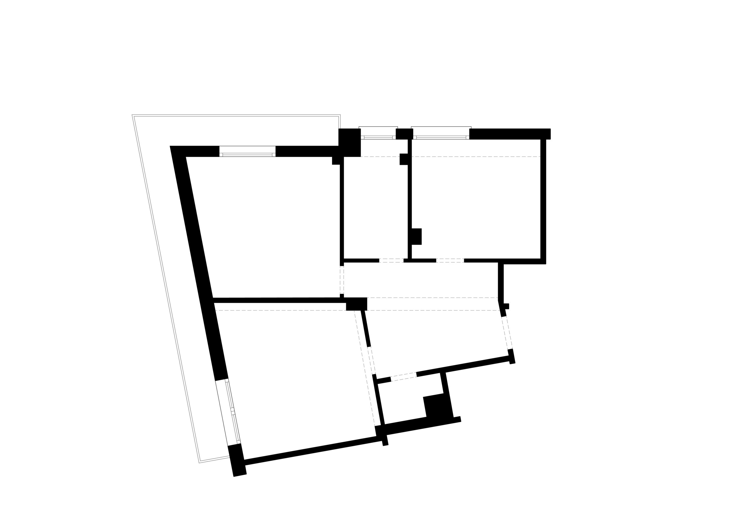 Existing plan
 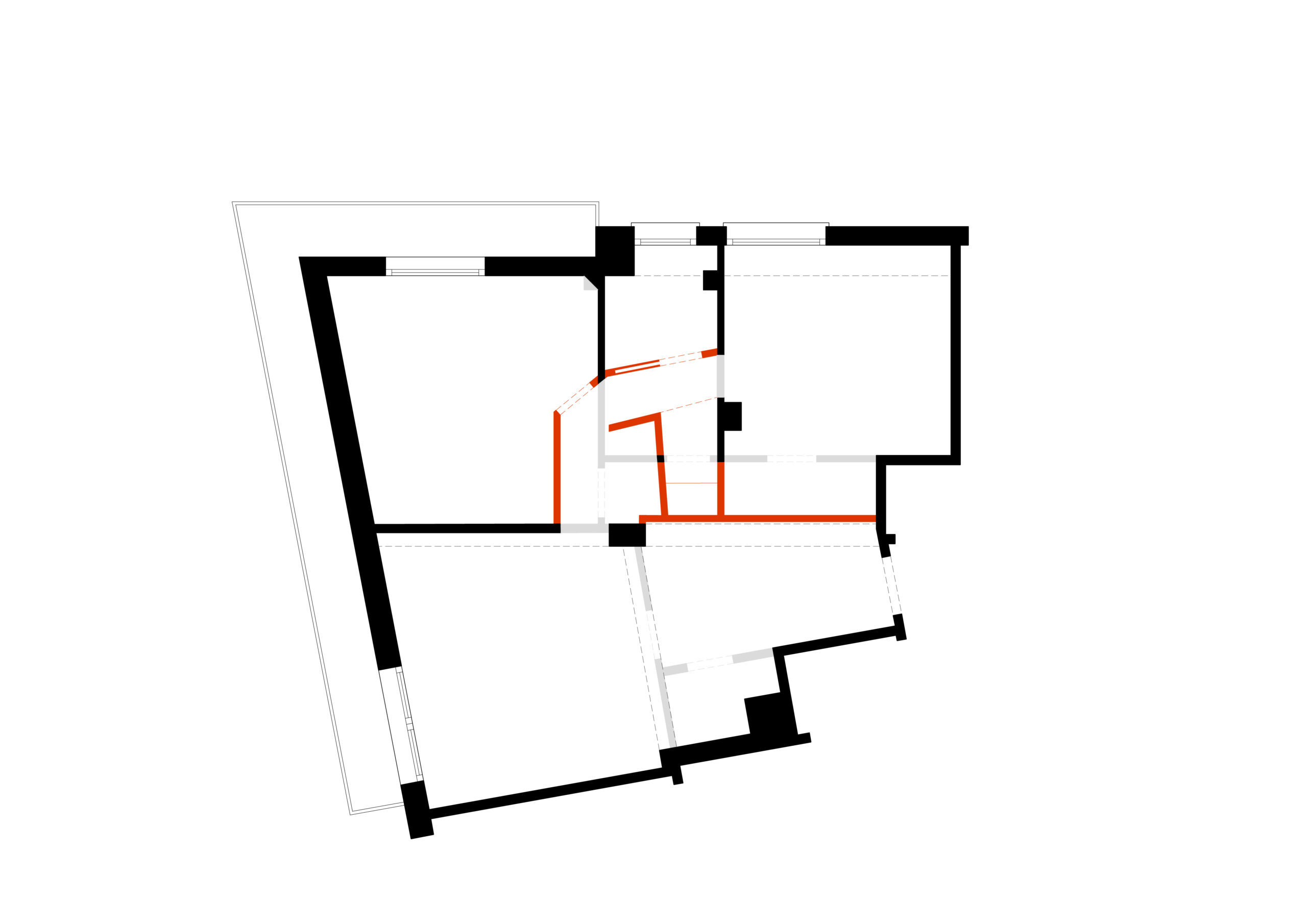 Renovation plan
 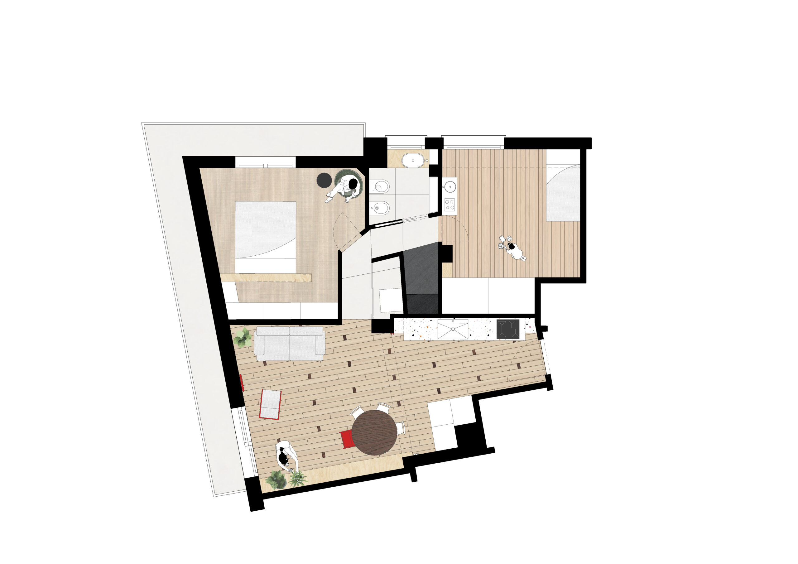 Project plan
 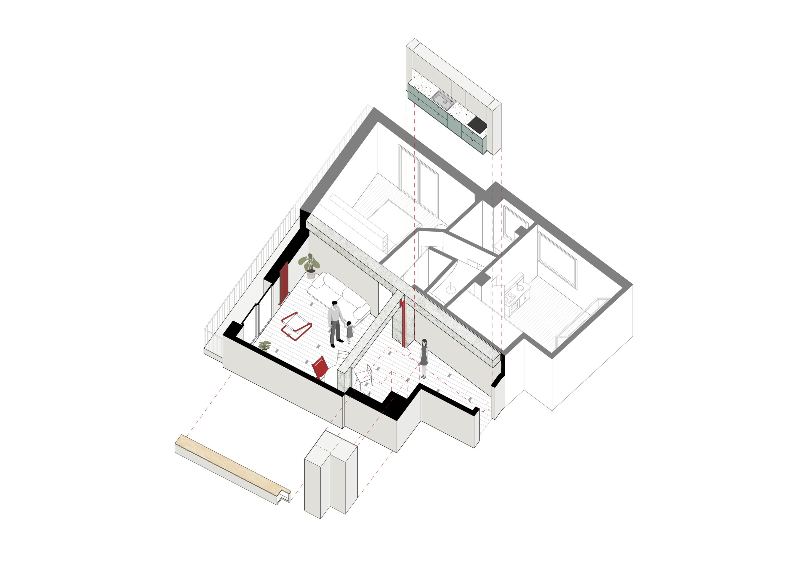 Axo living
  Axo bedrooms
CM . IA


CM . IA house: a rational revolution.
At the end of 2020, in the bolognese countryside, the new construction of a detached house with a private garden and close to a public park started.
We were contacted to deliver an interior design projects but after a first meeting with the clients, we proposed also to review the general layout having a new one where the furniture will be protagonist of a strong spatial change.
We had a generous volume under a double pitch roof with a consistent slope, so we started working in section and we proposed a new mezzanine.
We thought a complete spatial integration where the upper level becomes a natural expansion of the living room at ground floor and we declined the “promenade” theme as a succession of backdrops.
The spatial revolution is based on a rational sequence of volumes that create visual backdrops and hide the classical connective and functional systems.
The staircase is incorporated in a sterometric volume and is visible frontally from the entrance while from the dining table the backdrop that we can see is the kitchen. The large green grey wall system also divides the living area from the sleeping area and creates an elegant and modularly balanced base that supports the light mezzanine with the wooden roof.
Purity, refinement and linearity are the values of living that the project wants to express and that are witnessed by the wood essences, colors, the lacquered furniture and the architectural details that we find punctually in the various areas. The wood is present not only in the laminated roof but also in the visible cubes of the cupboard, in the staircase and in the details of the handles.
After the long equipped wall we find ourselves in the sleeping area where the doors flush with the wall at full height define the cleanness of the connections and guide us to the bathroom that concludes the succession of the scenes identifying itself as the last and most precious among them for peculiarities of details and materials. The theme of this space is “inception”: small gold inserts enrich the materic grey gres on the walls and the shower glass is shaped on the top that supports the two circular bowls.The satin gold faucet fits elegantly but gracefully into the space and the light bodies also complete this picture in which the containment becomes an opportunity to balance the horizontality of the top with the verticality of a wooden volume with ribbed finish. Even in the rooms we find custom-made furniture in colors ranging from light blue to dark blue and that are combined with the warmth of wood.
The furniture in this project is real architectures and not just decorative elements: they define the space becoming connecting elements, alternating moments they hide with others they reveal. Going in this direction we have not only the mentioned staircase-kitchen module, but also the white cupboard that is filtering the entrance with the garage and is also a coat hanger, while the kitchen is in relation with the bedroom armchair and the plasterboard volume on the top of it that hides the suction system. In the mezzanine, we used the column to divide the relax area from the small office and the connection is done by an L scaped custommade piece of furniture .
The furniture pieces are like bodies that lie on a grey background and they are clearly cut by the zenithal lught coming from the velux in the roof. In this project is renovated the eternal play of the architectonic narration done by radical choices, compromises and playful experience to reach our rational revolution.
Description
Executive project of new layout in a new construction detached house with project of custom made furnitures
Client
Private
Assignment
Concept design, tender stage, executive design and artistic supervision of construction site
Area
130 mq
Location
Bologna
Year
2020-2023
Photographer
Nicolò Panzeri
Furniture
Brentarredi
Maurizio Barbato
Shower glass
Vetreria San Donato
Metal furniture
Arteferro
 Ground floor plan
  Mezzanine plan
  Long section
B . RE


B . RE house: compositional balance reformulation
Close by Giardini Margherita, in a great value building, our work has involved an apartment resulted by a fractionation with the scope of a new layout for the resulting spatial configuration.
On the same floor, in the past, a dwelling and a dental clinic coexisted covering 300 sqm. The entire laboratory and part of the dwelling, previoulsy totally inhabitated by the mum of the client, have became the new home of a young couple. At the end of the works mum and daughter share the same floor with a fair split of sqm for the two indipendent apartments.
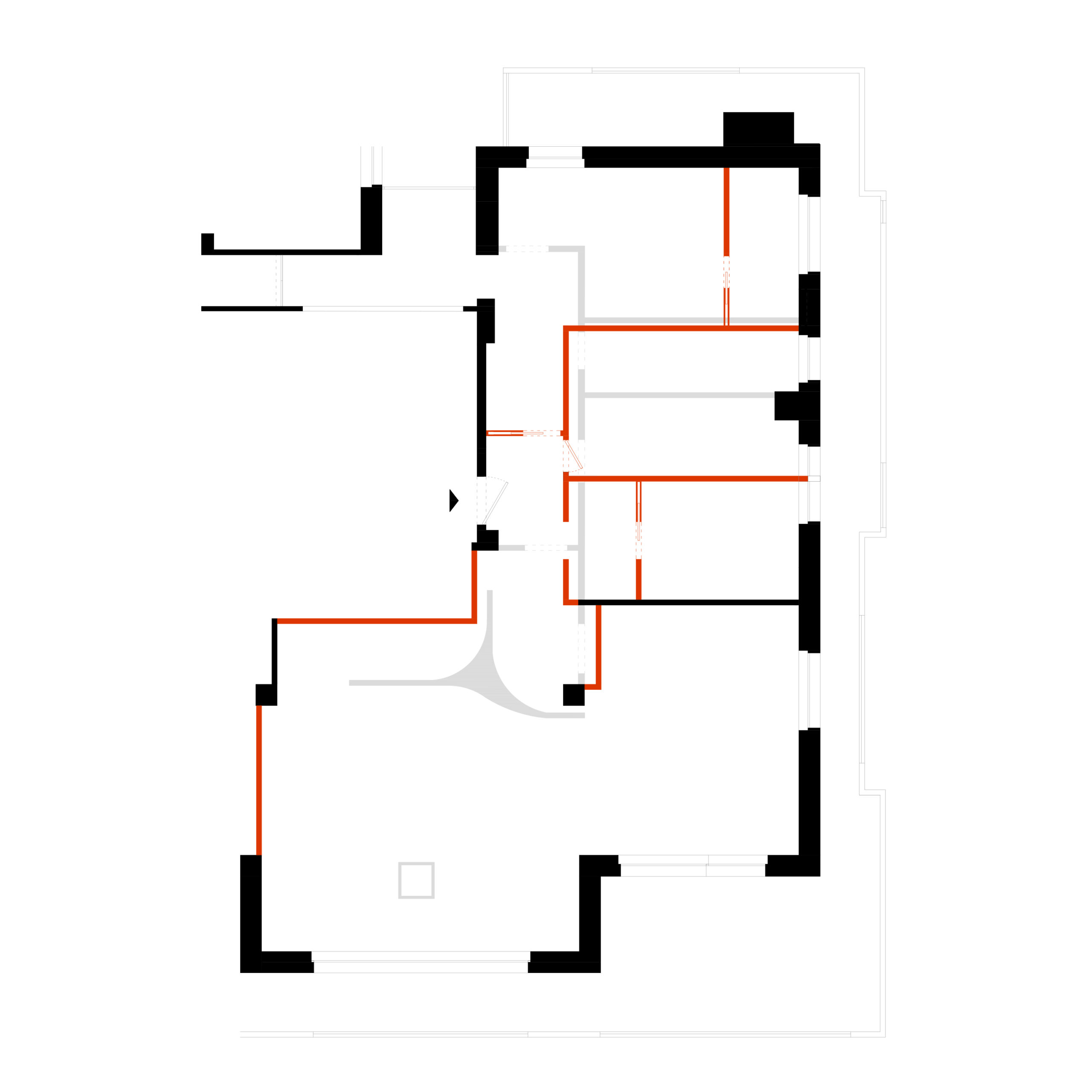
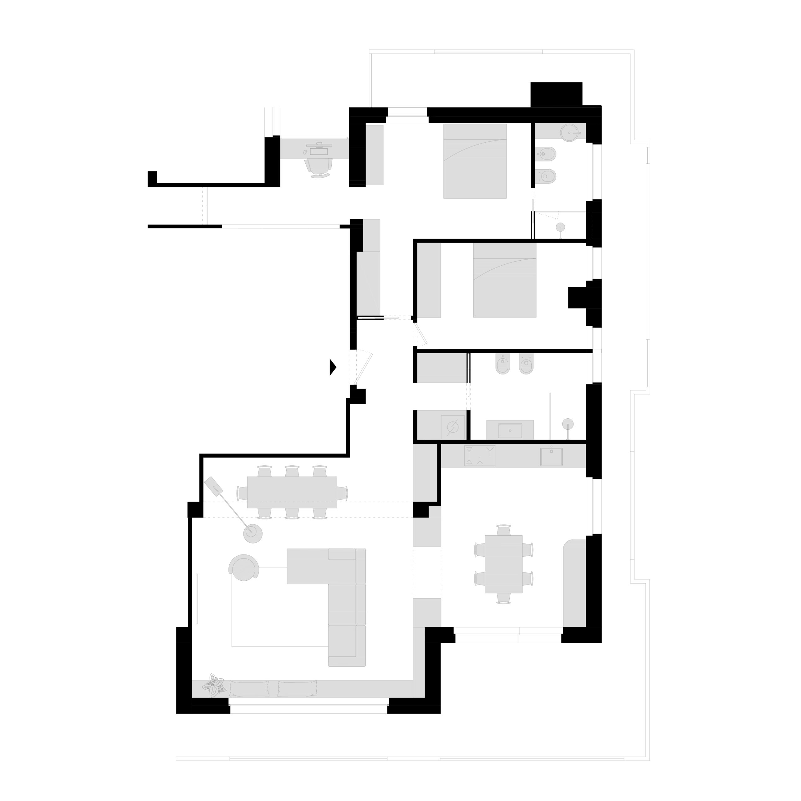
The generous openings and the elevations modularity were thought for old spatial proportions, very different from the new resulted ones. Harmonizing elements from a past with generous openings together with new spatialities was the challenge.
After a removing process of additional elements that weaken the openings visual, the existing becomes a neutral and minimal background where some thought perceptive inceptions became the right neutral and gorgeous backdrop. Here numerous perceptive inceptions become the right telescope for external glimpses.
Following this strategic-projectual strategy, we have propose the portal between living room and kitchen that not only divides without splits, but also makes new frames and helps to define visuals on the existing openings. Without renuncing to the functional need of storage, this piece of furniture designs new perspectives that enriches the space becoming a silent protagonist. The choice of the white lacquering and birchwood create a light backdrop that doesn’t interfere with the darker essences of the existing maintained windows and parquet.
We ended up with a spatial articulation where kitchen and living room are always connected without having primary and secondary viewpoints.
In the kitchen are the sky blue customized furniture that becomes the prospective protagonist. This piece of furniture with an rounded corner, through the reeded finish, makes a pleasant backdrop.
The laundry area and the bathroom are identified by the “green” incursion. In this case the target is identified a new scenario that is still connected to the past through chromatic similarities as in the balconies. In a poetic where connections and differentiations are alternated, the lacquered green doors in the laundry are joined to the cabinet in the bathroom through an enjoyable aestethic touch and the gres coating makes a continuous surface as an elegant dress under an intense light.
The project was mainly focused in the spaces shown in the photos, but the refurbishment includes also the new studio and the clients’ bedroom with the private bathroom.
This challange of union withouth a complete fusion and of respectful incursion make a new spatial alchemy that defines the new identity of B . RE house.
Description
Refurbishment of a private apartment
Client
Private
Assignment
Concept design, tender stage, executive design and construction managment
Area
150 sqm
Location
Bologna
Year
2024
Photographer
Stefano Maniero
Construction works and installations
DANILA COSTRUZIONI S.r.l.
Furniture
Maurizio Barbato
 Renovation plan
  Project plan
B . CL


Casa B . CL: a playful optimization.
In Bologna Meloncello area, near the city stadium, a minimum size apartment with an unpredictable future has been transformed balancing shapes and colors.
47 sqm can expand perceptually if the right decisions are taken without giving up to a playful experience. How can it be possible? First of all transforming an hallway into a kitchen, then designing a piece of furniture made by solids and voids, along a structural portal transformed into a double archway.
The apartment spaces weren’t adequately exploited, so the layout was redesigned eliminating two main elements: the long entrance hallway and the tiny dining room. This wasn’t used because too small, the only heating system was an old stove located on the left close by the entrance, on the wall that divided this space from the living room. This wall was demolished and a new structural portal was created. To have an hall and a wardrobe in a single piece of furniture, we designed a customised closet that also frames the kitchen having a playful role.
Through it, we have been able to maintain the new openspace and to have a functional volume collocated between the two arches.
We decided to not express the structural frame and we have used plasterboard to create two arches with a small central area where the “hole furniture” is located becoming a double face element: from one side is shoe rack and closet and on the other side the final element of the kitchen.
The apartment has been equipped with heating and air conditioning system, sections of the floor were removed allowing the passage of electric and hydraulic system and the parquet was placed on top creating a warm background for the new plastic and colorful volumes.
The elements that could have formally spoiled the project, became instead an opportunity to characterize it. So the old hallway between the bathroom and the bedroom, was reduced to have the new laundry expressed by a clear blue volume to hide the misalignment between the walls.
The two arches have been designed to pass seamless from hall to living room and kitchen delimiting softly the spaces and the void of the entrance furniture let you look the kitchen being also a seating area.
Functionality and play coexist together with shapes and colors. The bathroom, revised and re-proportionated, becomes a mediterranean ambient where the brightness of the small white listels exalt even more the white and blue geometries of the pavement.
B.CL house is an house that reflects the personality of its inhabitant: a young designer that projects without forgetting the importance of play and smile.
Description
Refurbishment of a private apartment
Client
Private
Assignment
Concept design, tender stage, executive design and construction managment
Area
47 sqm
Location
Bologna
Year
2022
Photographer
Nicolò Panzeri
Structural project
Ing. Claudio Contini
Construction works and installations
Sige Tecnologie S.r.l.
Finishes
Igor Danila
Furniture
Maurizio Barbato
Kitchen
Schmidt
Shower glass
Vetreria San Donato
 Renovation plan
 Project plan
 Existing axo
 Project axo
 Structural drawing
B . FE


B . FE pub: Felsinean synesthesia
The new The Rocker Inn is not the “former Circolo Pickwick,” because even though it occupies the same physical space of the first historic pub in Bologna, it has changed not only its name but also its essence.
Commissioned by the new management, Estragon, to give stylistic and material form to this desire of transformation, we began a process of subtraction, research, and juxtaposition in order to bring The Rocker Inn to life. Certainly, the venue could have remained as it was—but if one changes the name, identity, and wishes to create a new atmosphere, then the appearance must evolve as well. However, change does not mean erasing the past. Recent managements had failed to grasp and enhance the richness of these historic spaces, and these walls had merely become “old.”
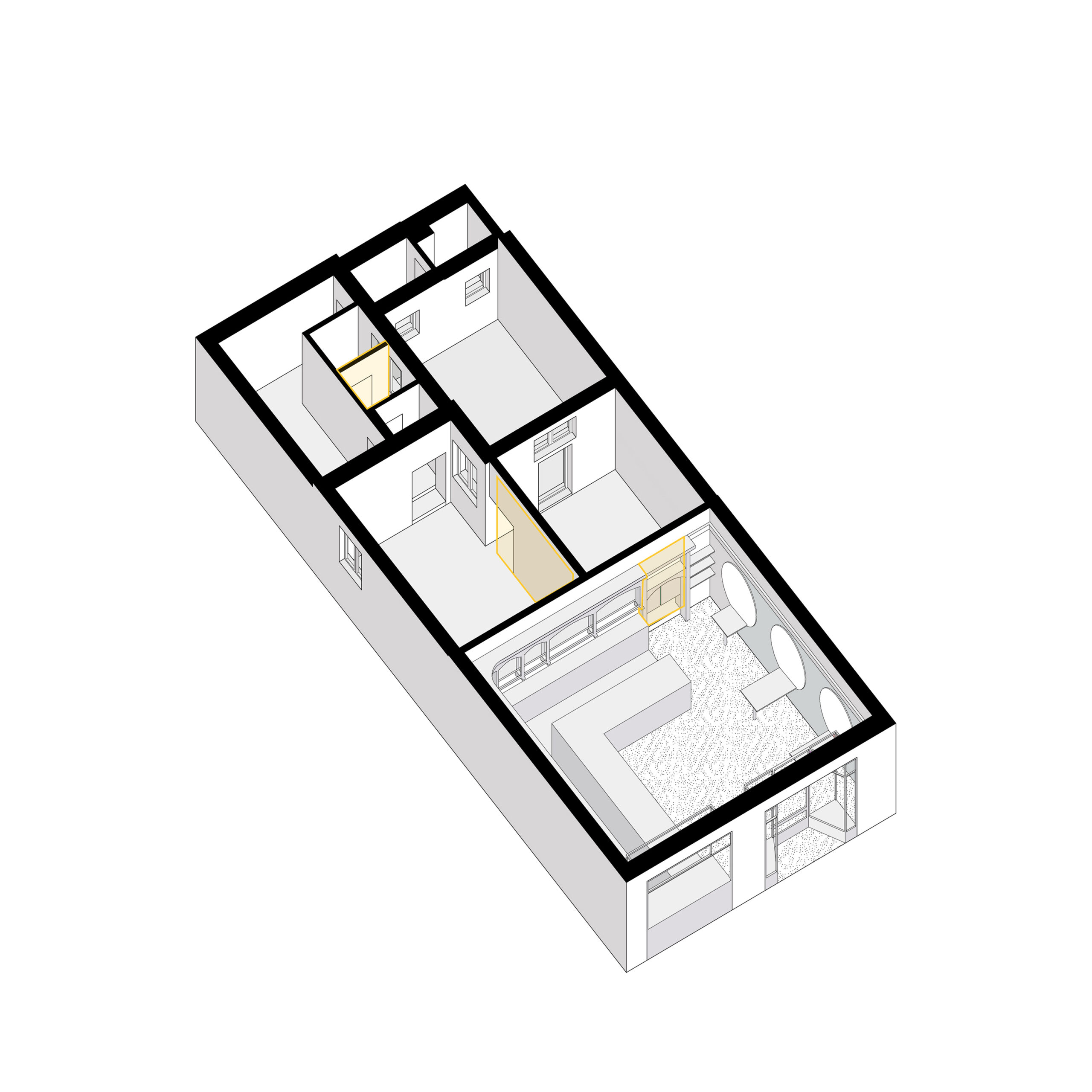
From these premises, the challenge of a collective renovation began—minimal in its final appearance, but deep in its principles. Some elements, of course, had to be preserved because historic, elegant, irreplaceable, and beautiful. Starting with the unchanged stained-glass door, the wood-and-marble bar counter with its solid wood back framed by arches and mirrors, and the multicolored tile flooring with a fine red-and-black terrazzo, we began to reflect on what could be altered and added.
Although character-defining and central, the bar counter seemed to close off the space too much. We realised it could be retained but slightly modified. Removing the portion with the “saloon-style” doors (clearly a later addition), we opened the view up of the courtyard, which had been waiting to host a stunning floral arrangement.
The property’s restriction—preventing public access to this area due to acoustic concerns—further encouraged us to emphasize its role as a green backdrop and as a visual lightener.
The rooms adjacent to the main hall once seemed dark and gloomy to many patrons. Few ventured beyond the bar area, as the small back rooms didn’t invite use. The new framing—with exposed carpentry—now creates a generous space that connects the two old rooms, which still remain more secluded than the first hall.
Thus, from the entrance, one can now glimpse the outdoor garden in a design that visually connects three spaces through an elegant sequence of layered scenes. The exterior reappears in a crescendo of intimacy and serenity, starting from the portico of San Felice, moving into the welcoming warmth of the main pub area—genuine and lively—and then into the more secluded, introspective tea room, which introduces the Zen calm of the internal patio. This alternation of spaces is tied together by materials, colors, and the evocative qualities of objects.
Another bold choice was to leave the red wall raw—revealing the building’s original use as a slaughterhouse. For years, wooden slats had concealed this rough beauty, which has now returned to the light.
The previous ceiling’s garish acid green/blue tones and its white map of Bologna were replaced by a darker green that, along with the old red of the metal frames, creates a natural binding tone. Customers have skillfully added paintings, repurposed furnishings, and tartan wallpaper for the vinyl corner. All this coexists with CHEAP prints, thoughtfully positioned.
The new managers embraced the suggestions to open up the visual space, to reimagine the spatial experience, and to stay true to the venue’s history—respecting the valuable elements—while also making it their own: a place where they can share what they love with their guests. And so today, flavors, scents, and new music intertwine daily in the Felsinean synesthesia of The Rocker Inn.
Così oggi sapori, odori e nuove musiche ogni giorno si intrecciano nella sinestesia felsinea del Rocker Inn.
Description
Refurbishment of a pub
Client
Estragon Club
Place
The Rocker Inn
Assignment
Concept design, tender stage, executive design and construction managment
Area
86 mq
Location
Bologna
Year
2024
Photographer
Stefano Maniero (all photos except 2)
Margherita Caprilli (photo 2)
Structure
Ing. Claudio Contini
Construction works and installations
DANILA COSTRUZIONI
Existing furniture restoration
Flavio Belletti
Decorative paintings and walls restoration
Monica Macchia
 Demolition axo
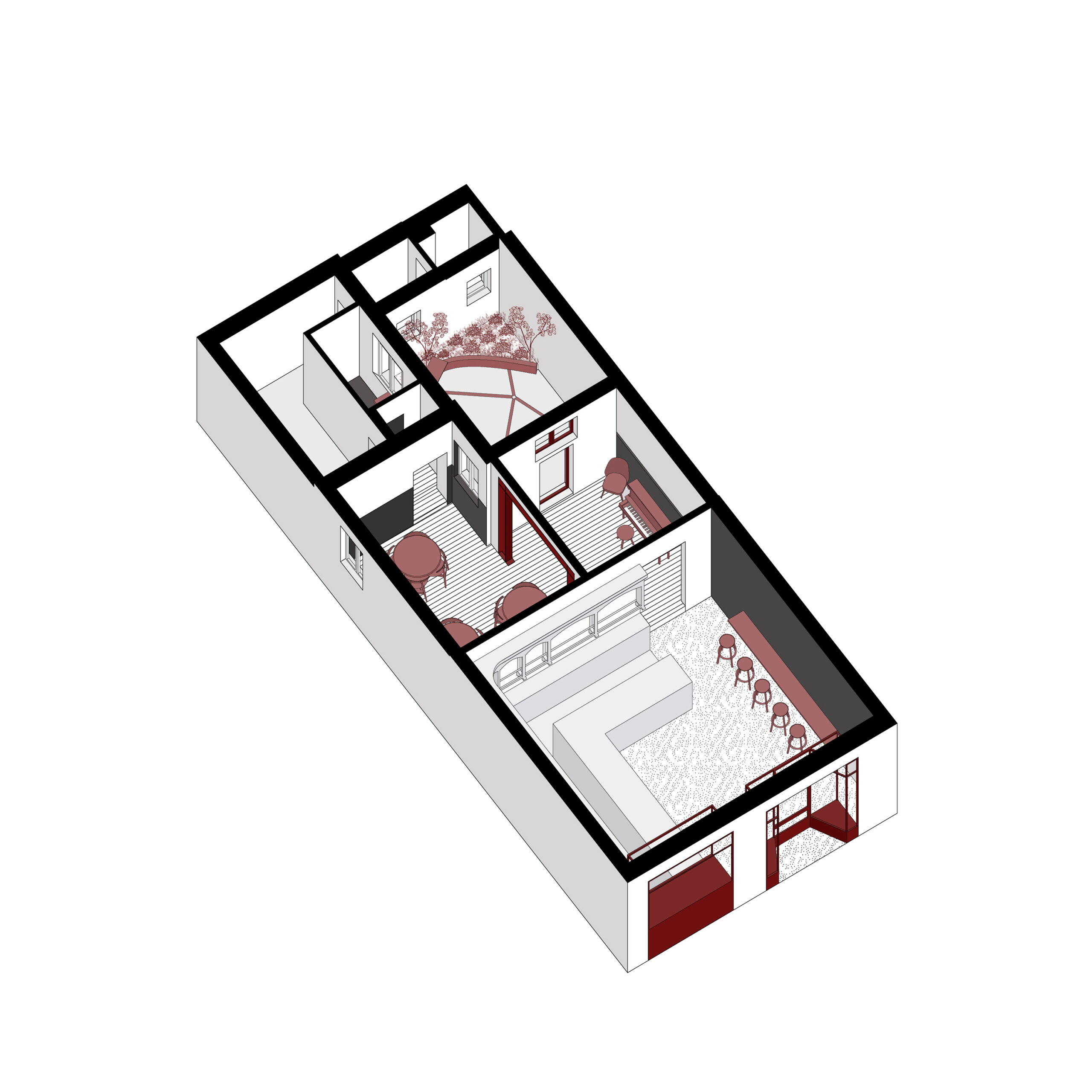 Preject axo
CS . P


CS . P House: welcoming and vivid two tone essence
In the area Croce di Casalecchio, in Bologna the transformation of an apartment with a not optimized layout ended with a new spatial custom configuration that fits the simple and decided needs of the client.
We have focused from the start on the theme of the entrance characterization. It had big dimensions and was nearly unused. The project creates a colorful linear initial space characterized by a long wardrobe that overcomes the classic concept of entrance having a trade de union element that links the hall to the kitchen.
The only way to not waste important meters having a stylistic coherence in the entire living are was creating a new open space where, through the use of the costume mede furniture, the areas are joined together pleasantly.
As soon as you step inside the space, the linear two tone piece of furniture drives the eye to the french window in the kitching/living area. This lighting backdrop attracts and makes the visitor analyzing the rest of the space secondly.
The two tone blue and white is the fil rouge that we can find from the hall, passing through the kitchen that has a top in quartz and blu color low modules, and arriving to the bathroom with its entrance. The division between entrance zona and kitchen is identified by a portal that connects living and sleeping area framing the entrance furniture of the bathroom.
In a neverending colorful play, where the tones reappears also in the bookshelf pieces, the functions remain but are lost at the same time and the flue is the opportunity to have shelves extending the kitchen and creating a perceptive filter.
The bookshelf bends creating a curved piece through the living room where behind the sofa, the table enjoys the light from the french window.
The blue from the bottom part of the living room conquers the entire furniture that is at the entrance of the bathroom, where the volume is made lighter by the shelves and focuses making an invitation of the bathroom. In this space beige tone are mixed with green and oak. The apartment is showed lived and colonized by the client: the guardian and user of this welcoming and vivid two tone essence.
Description
Refurbishment of a private apartment
Client
Private
Assignment
Concept design, tender stage, executive design and construction managment
Area
80 sqm
Location
Croce di Casalecchio (Bologna)
Year
2024
Photographer
Stefano Maniero
Construction works and installations
DANILA COSTRUZIONI
Furniture
Maurizio Barbato
Windows
Falegnameria Art Legno di Andrea Raggioli
Parquet
Casa Pastorelli
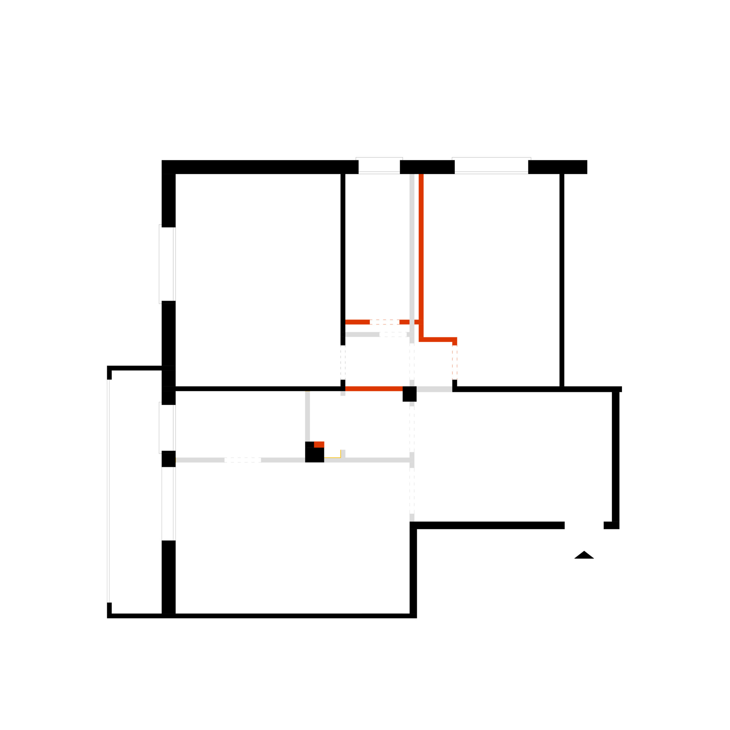 Renovation plan
 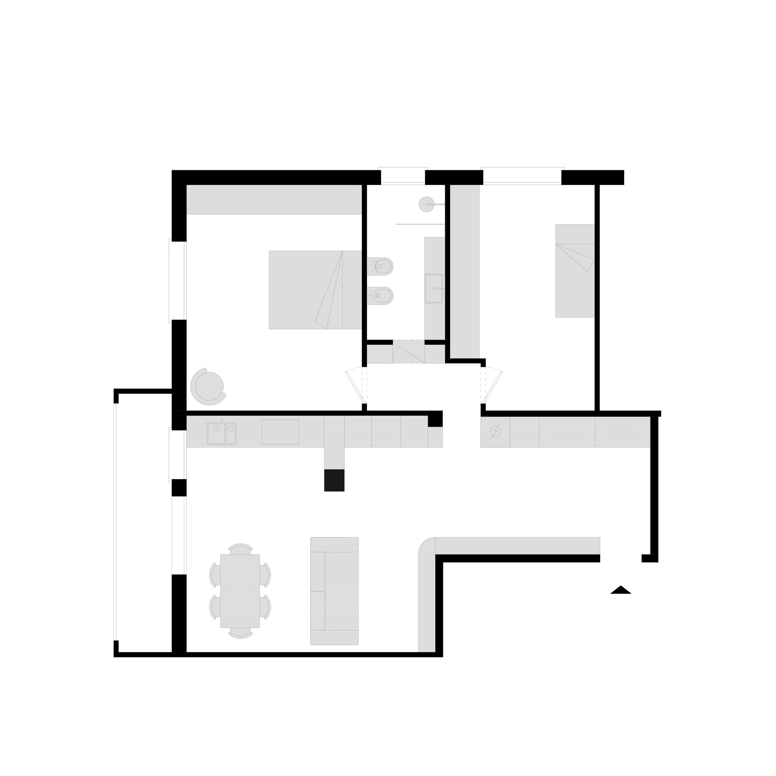 Project plan
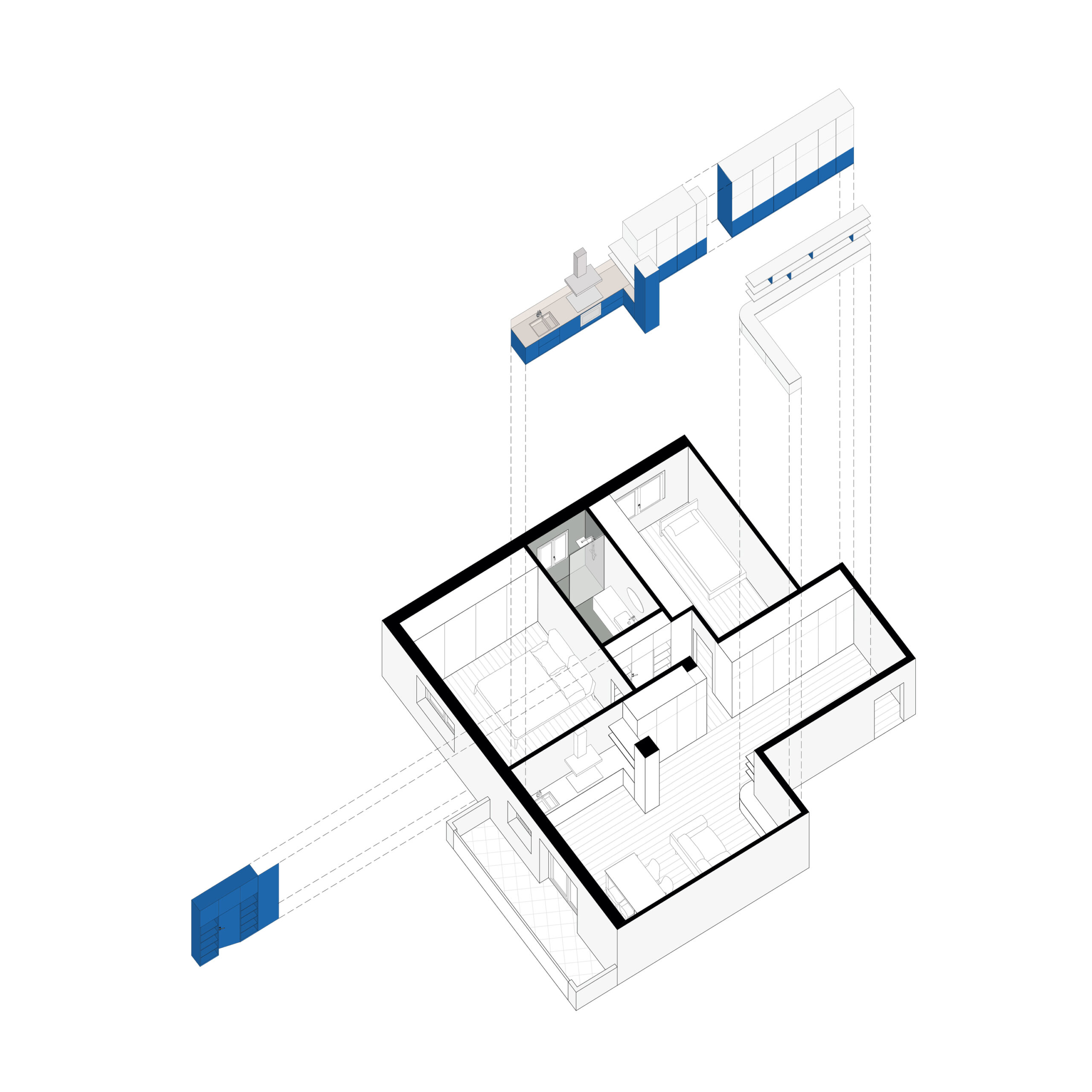 Project axo
B . I


B . I house: a gentle meeting of visions.
B.I house is a “bolognese” space that welcomes without showing off, an apartment with smart and sensitive changes aiming to maximize the potential of the existing space.
The project expresses some themes that are very important for the practice research: the maintenance of valuable elements, legacy of the past, without losing the renovation opportunity. The additions are resolute and functional with modern components that are impressive and simple at the same time giving a minimal and warmth touch.
This is visible from the entrance, where vintage second hand mirrors with golden frames stand out on a raspberry plum wall. On the right an elegant portal drives to the openspace: a bivalent ambient with the kitchen on one side and the living room on the other. The two areas are highlighted by a change in materials: the linear kitchen is connected to the rustic gray cement finish over terrazzo gres flooring that replaces the ancient parquet just in this area. The wall finish passes from cement to wallpaper reaching the other side of the room with the custom bookshelf faced by the green sofa.
In the bedroom the wallpaper covers also the bed head wall fading into the intense blue ceiling. This intimate space is completed by the full height white wardrobe and some vintage furniture.
The bathroom is a surprising space with a great material combination of “cocciopesto” and big size gres tiles with green tones inspired also by oxidized copper. The “cocciopesto” is an antique technique based on lime that has an unequal and materic finish and this style goes on in the space with the textured tiles till meets the shower divided by a minimal and modern crystal slab.
The cement top is in conjunction with the kitchen one. It makes the base for the oak piece of furniture and the ceramic white oval bowl.
To complete the picture, we find arch shaped mirrors that create a playful and smart corner integrated with the lighting system.
Minimalism and warmth, essentiality and decor join together in the house where Ci has met MA and where they currently live.
Description
Refurbishment of a private apartment
Client
Private
Assignment
Concept design, tender stage, executive design and construction managment
Area
58 sqm
Location
Bologna
Year
2019
Construction works and installations
Altoponte S.r.l.
Furnitures
Brentarredi
 Renovation plan
  Project plan
  Existing axo
  Project axo
B . N


Casa B . N: don’t move, improve!
Center of Bologna, Via Nosadella, a young couple is waiting for the second son in a special and welcoming house but small, with a weird layout and a not fully utilized patio.
Changing apartment and leaving all the memories awayto explore new horizons should seem the right solution, but would it be really impossible remaining in a readapted space?
Maybe no…but a bathroom sholud be canceled and it seems “almost” impossible adding a shower to the remaining bathroom.
We work on this “almost” to have a bespoke project that shows how sometimes the first choice is not always the resolutive ones.
In the new layout the children bedroom becomes bigger including the space of the deleted bathroom and it is enriched by new simple and colorful pieces of furniture that makes Bea and Ale’s bedroom a playful space.
The reamining bathroom should be gifted with shower. The choice is adding a new green block. This element represents a strongly characterized and characterizing add connected to a pavement change: a new transition area is created.
The intervention, as in other our projects, is clearly expressed, it is not hidden and becomes a possibility of chromatich enrichment.
The resistence inhabitative act is expressed recalling a poetic where the intervention finds an exact place in the existing space.
If outside the volume is sharp and smooth at the same time through the green color, inside the pure white becomes the protagonist together with the organic drawing that connectes shower and washbasin. If the line seems simpering forstly, it’s the most optimazed spatial way to solve the space.
Brightness and minimalism are targeted through white listels and alternation of concave and convex surfaces that create light games and reflexes in the shower. An extended mirror surface and a bespoke piece of furniture with a final birch panel on it complete the curve in a system that seems almost suspended inside the green space.
Custum furniture is drawn not only in the living area and in the bedrooms, but also inside the new “pergotenda” in the patio. Inside the grey furniture under the “pergotenda” not only clothes are washed, but also some mornings, Matteo shaves the beard.
Also this small behaviour showes us how much the clients would stay in the aprtament…where everything remains and everything changes.
Description
Refurbishment of a private apartment
Client
Private
Assignment
Concept design, tender stage, executive design and construction managment
Area
79 sqm
Location
Bologna
Year
2022-2023
Photographer
Andrea Cippitelli
Giuseppe Venza
Construction works and installations
Edil Virruto
Furniture
Maurizio Barbato
Shower glass
Vetreria San Donato
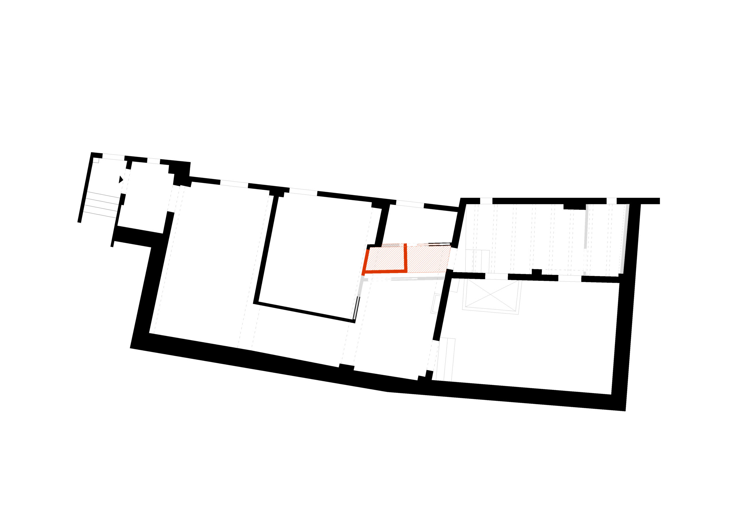 Renovation plan
 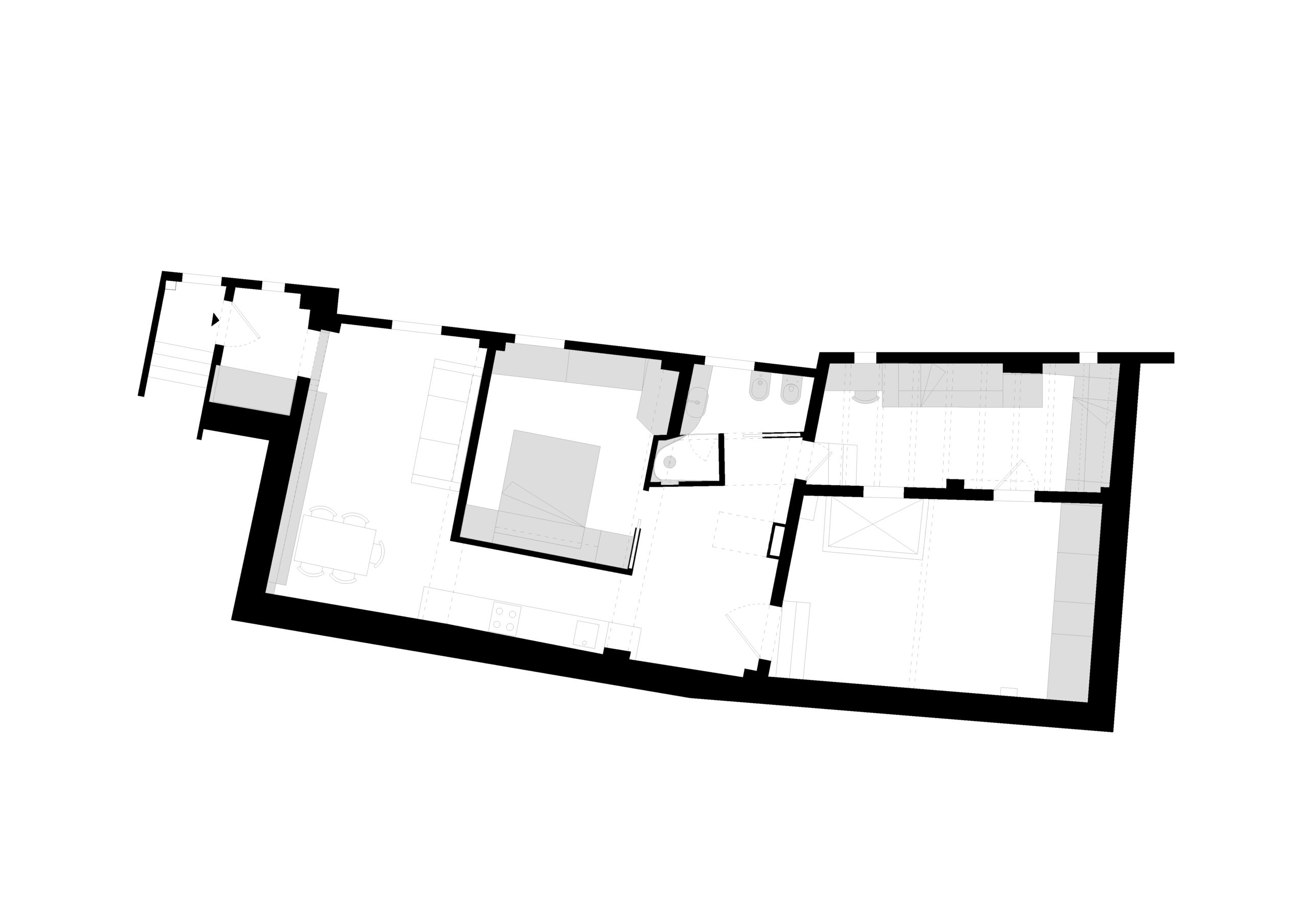 Project plan
 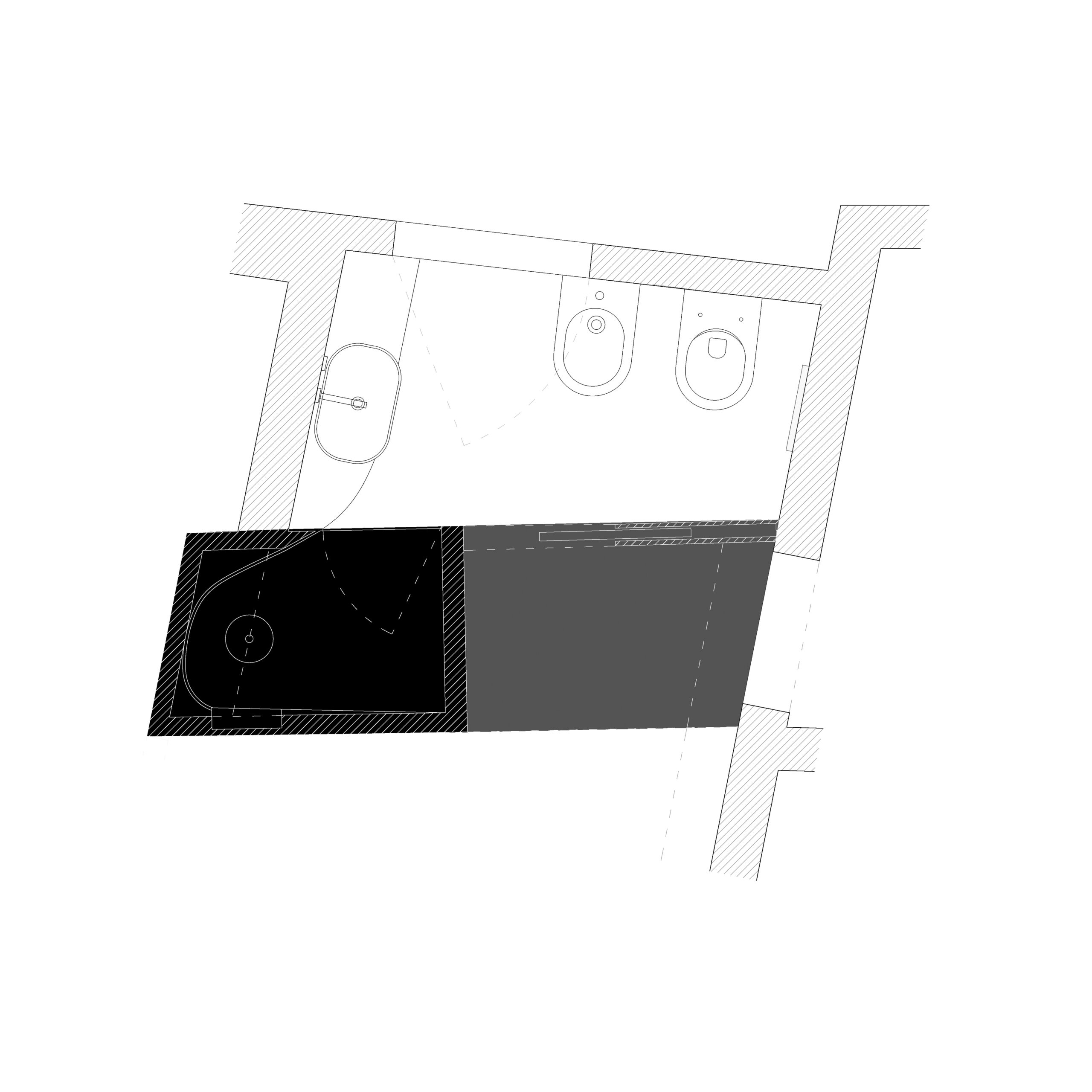 Bathroom plan
B . P


B . P house: the power of respect.
This intervention has involved an apartment in Santa Viola area in Bologna. Located on the last floor of a ’60s building, it has remained as originally designed. The needed modifications permit to rent the apartment: we have operated just on the shell and the internal finishes while the furniture choice was left to the future tenants.
The main target was respecting and valuing the consistent heritage of the place: polychrome marbles, custom furniture and generous spaces were maintained and developed through a careful mending of the new voids to give new life to this elegant apartment.
In the living room we had to maintain the yellow Siena marble, the old wood frame door single glazed and the oriental bar closet.
We have eliminated the grey wallpaper, the maintained elegant door stands out resilient and smart and you can overlook the new kitchen. Close to it, we have created a new hall that was detached in the past and gives now a simple new touch to the house.
The kitchen space and the dining room perfectly represent the theme of the intervention: although often the change is hidden or covered to let the new comes, in this case the past is underlined and expressed strongly because it has the same design importance of the modern parts.
Different materials are joined together: the existing marbles are connected by the new gres pavement with metal effect and the final status is a renovated balance where different layers coexist in a dynamic configuration.
The kitchen, in coherence with this approach, doesn’t hide its modern and new status being placed over a new dark piece of pavement.
Light, simple and not protagonist as the power of respect.
In the bathroom, as the client requested, the old yellow mosaic is maintained and the new dark gres is joined to it: the final result is a new bathroom with a vintage flavour.
This project reflects our approach that targets to valorize the existing if, after analysis, is judged as interesting and integrable. We like using new techniques and materials to create interesting mixes with the elements remaining from the past to express our personal creative result. The limits become enrichment to create a new scenario where past and present are joined in harmony.
Description
Refurbishment of a private apartment
Client
Private
Assignment
Concept design, tender stage, executive design and construction managment
Area
110 sqm
Location
Bologna
Year
2021
Construction works and installations
Altoponte S.r.l.
 Flooring plan
 Project plan
B . C


B . C house: the minimal adornment.
Changing without making it notable and being minimal could be a choice and it often represents a trend in the last years. In this case we have faced a real necessity to make our intervention minimal but snappy.
The apartment is located in one of the most beautiful areas in the downtown of Bologna, close by Porta Castiglione. The strange shape is connected to the central court and this affects the interior design.
The house was already completed and functional, but the clients wanted to completely review it to feel it really their home. To reach the target we have operated on furniture, coatings and lights without losing the main target of minimalism. We updated an apartment belonging to the past toward the modern needs of a growing family: the conditioning system has been added, we have rethought the living room and completely changed the private bathroom of the master bedroom.
The elegance of the apartment is the same of our clients, which allowed us to preserve the main essence of the spaces celebrating them with strong and brave decisions.
The cement sink is the synthesis and the manifesto of this approach. The bathroom is narrow and long , with all out of square walls, so we have introduced an organic and monolithic object: a custom cement sink designed by us completely shaped on the surfaces of the space. It is an unicum not only for material but also for its shape.
We have started from this object to apply the minimal adornment to the entire bathroom: big size grey tiles on the floor to create a neutral and uniform background to host the monolith. Matt and shine small white triangular tiles on the wall that are reflected by the two mirrors to enlarge the space.
The same approach has involved the furniture in the living room (partly bookshelf and partly food storage) where the voids left from the old intervention were used and joined together by a white and minimal basement/sitting area.
The valuable spaces are carefully illuminated by the new materials: in the external patio the new light pavement helps to enlight the space. New lights are introduced to fill the lighting gap of the apartment.
In this case doing exactly what it was necessary and nothing more was essential to reach the minimal adornment.
Description
Refurbishment of a private apartment
Client
Private
Assignment
Concept design, tender stage, executive design and construction managment
Area
93 sqm
Location
Bologna
Year
2021
Construction works and installations
Altoponte S.r.l.
Furniture
Brentarredi
Custom concrete sink
Cemento Line
Metal furniture
Arteferro
 Project plan
CP . SC


CP . SC
We could sum this project up with two words: Maremma and 110. An old cottage built at the end of ‘800 in Castiglione della Pescaia was retrofitted by an intervention of Superbonus 110 to have an energetic update.
The rural complex was made by a two storey house and an old stable converted into a warehouse.
Our intervention has involved the second floor of the main building, reshaping the apartment layout and optimizing the space. The main demolition has involved the additional suspended ceiling that wasn’t part of the original building and through the ages has covered the wonderful wood beams and lowered the space.
The new hybrid heating system is connected to the photovoltaic one installed above the stable roof allowing to heat up and cool down the new spaces of the bedrooms and the new openspace that not only has doubled the area up but has also increased the volume with the new heights.
The perimetral loose masonry has been consolidated through the “betoncino” technique and thermally insulated with an internal new layer.
The same insulation has been added under the roof , the division between living room and one of the bedroom has been demolished along the addition of two more bathrooms.
The retrofit and modernize challenge for an historic building of Maremma with no foundations has permitted us to face the theme of the existing in a completely new environment giving us a great motivation to reach the final result.
Outside the building retains the same brick aspect that represents it from the construction and permits the landscape integration, inside the intervention shows its contemporary essence.
A new continuous pavement becomes a connecting element for the spaces that are defined with different materials, styles and colors. Reused furniture and new lighting elements create this unique balance, reflecting the spirit of this holiday house in Tuscany where the clients from Rome and Bologna go to enjoy their relax moments during the year.
We have maintained and brought to new life old parts of the existing architecture, supplying what the owners needed to enjoy these renewed spaces.
This intervention represents an example on how the architectonic act preserves the past making the spaces suited for present and future uses.
Description
Energy retrofit Superbonus 110 and refurbishment
Client
Private
Assignment
Concept design, tender stage, executive design and construction managment
Area
114 sqm
Location
Castiglione della Pescaia (GR)
Year
2021
Construction works and installations
Ciacci Costruzioni
Hydraulic system
Gianfranco Lentulo
Electric system
Beghelli Ugo
Photovoltaic system
Ciem s.r.l.
Technical collaborations
M&E engineer Per. Ind. Maurizio Ferri
Health and Safety ConsulTec Snc
Structural project Ing. Marco Orlandini
 Renovation plan
 Project plan
 Project axo
R . AS


R . AS center: the color space.
This project is identified as restyling of a medical center.
The main challenge was making more pleasant an area of the center attached to the main part in a second phase.
The target has to be reached with a low budget and without changing the layout.
Color is the real protagonist.
Can color define the space?
Color can create perceptions so it could define spaces. With a small budget, we have managed to give more depth and pleasantness to the connecting spaces and to the gym bringing back peace and balance inside the physiotherapy boxes.
The other important element was the light. In the corridor we have changed the disposition of LED lights to have longitudinal direction and to be in coherence with the new color bands.
Lights and colors are joined together to give new life to spaces that had just a functional essence before and are playful and interesting now.
The dark ceiling has been eliminated in the boxes to avoid that these small spaces could appear even smaller and the lighting system completely reviewed with a lateral lighting cut and new minimal spots on a track.
Balance and right color selection, in coherence with the merchandising, were the main actors of the restyling with the simple, but radical intervents too.
Our final answer is clear: color could be space and space could be color.
Description
Restyling
Client
Centro Attiva – Medicina Riabilitativa Fisioterapica
Assignment
Concept design, executive design and construction managment
Area
Rastignano (BO)
Year
2021
Finishes
Damiano Rutigliano
 Project plan
CD . CSD


Concorso CD . CSD: nexus an urban sport facility.
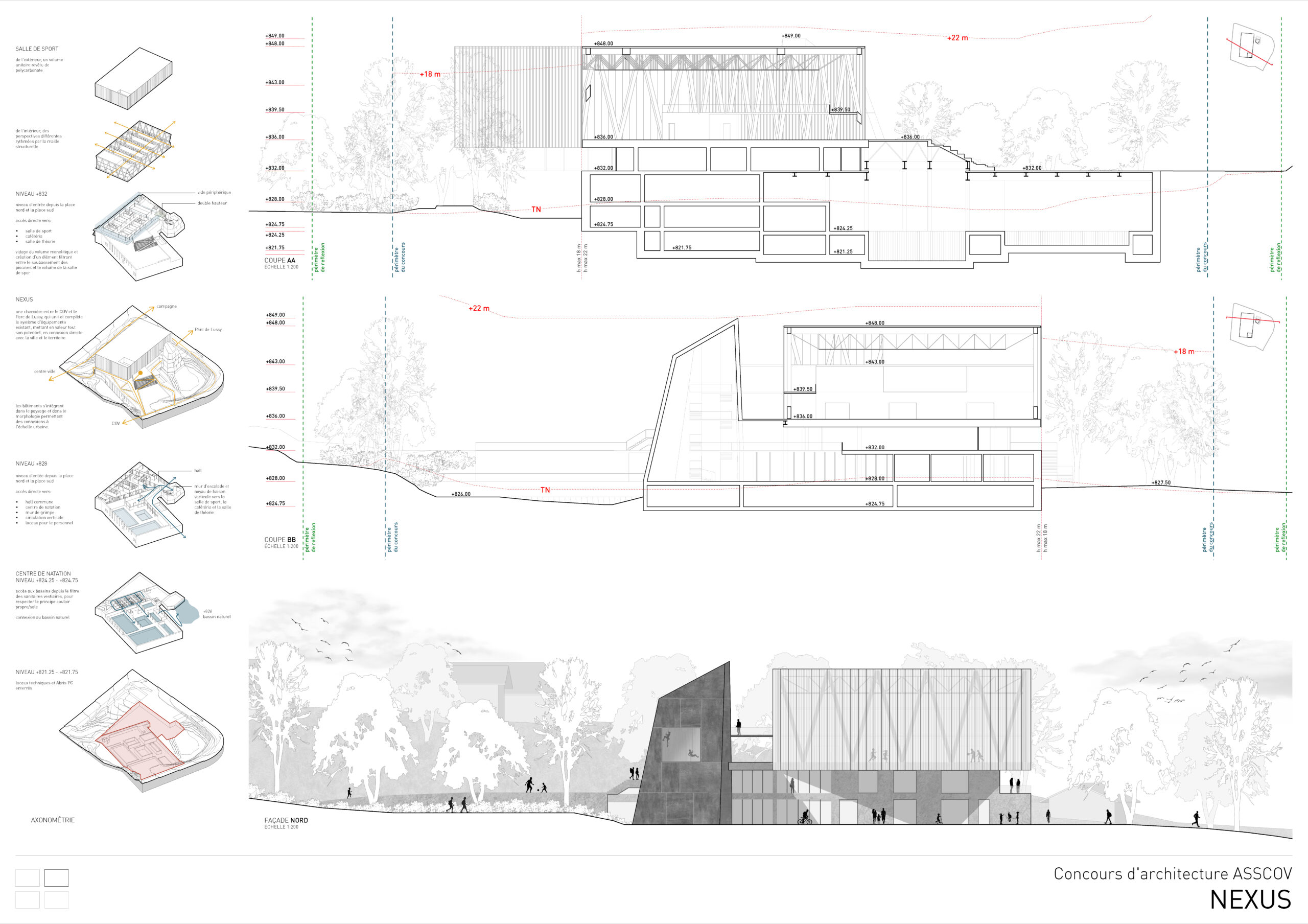
The new sports complex, consisting of a triple multi-purpose gymnasium and a swimming center to be built in Châtel-Saint-Denis, a small Swiss village in the Canton of Fribourg, becomes an opportunity for a new urban vision. The design proposal presents not only a new building, but also the development of a public space that originates from the layout of the new sports center, aiming to create a fully integrated urban environment.
By analyzing the topography, the idea emerges to place the swimming center entirely underground, while its roof becomes a green roof that hosts a public stepped seating area, creating a space for the community. This area is surmounted by the translucent polycarbonate volume of the triple gymnasium, built with a significant timber structure that strongly contributes to the overall aesthetic definition of the new center.
The complex is completed by a prism with a metal cladding, housing the climbing gym, which becomes a landmark and defines the entrance hall of the center. It completes an area of the city with a strong sporting vocation and establishes a connection with the adjacent COV center.
The outdoor swimming pool, located near the climbing block, is set within an existing depression and, like the other parts of the complex, contributes to a “natural” integration within the overall context of the project.
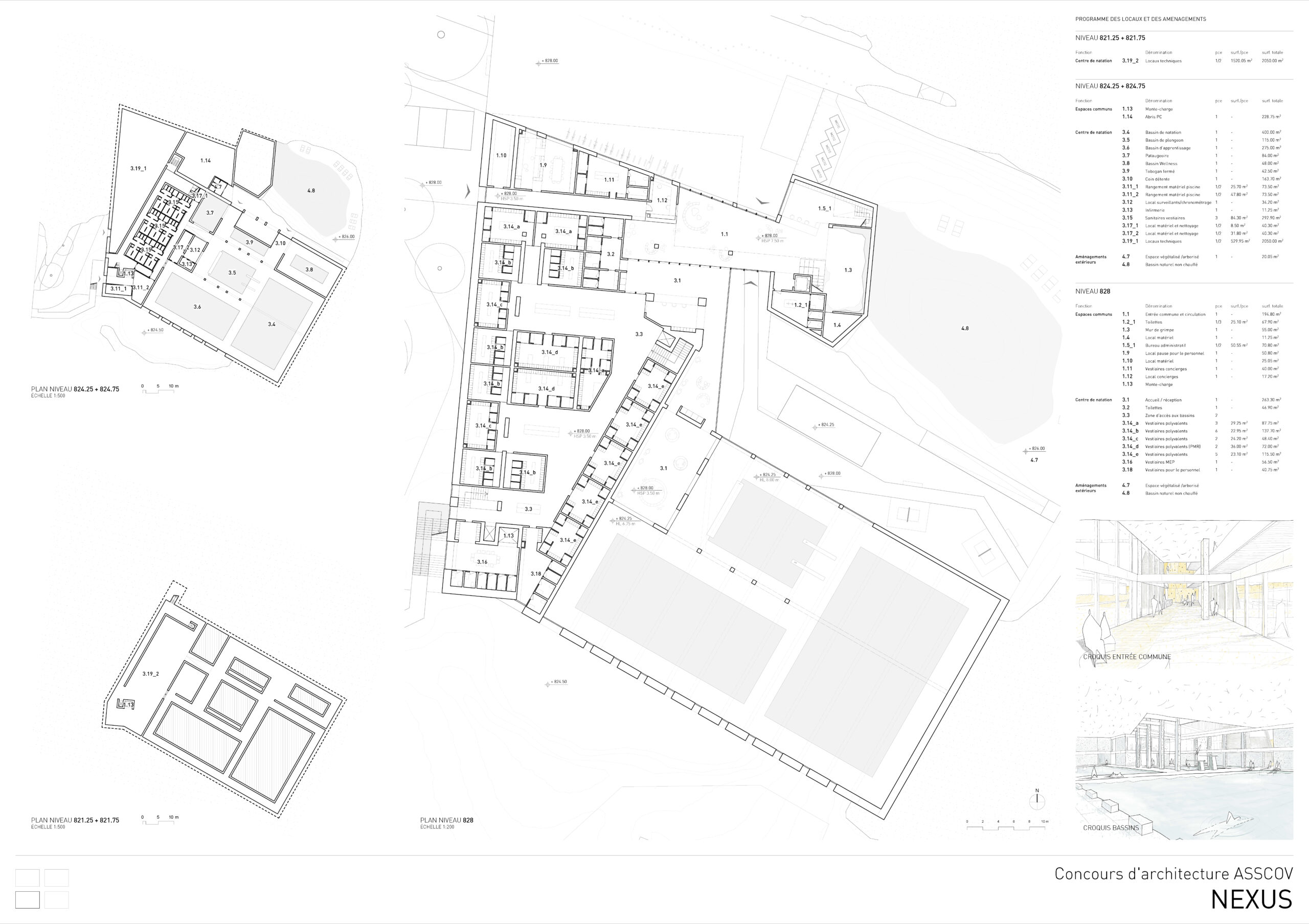
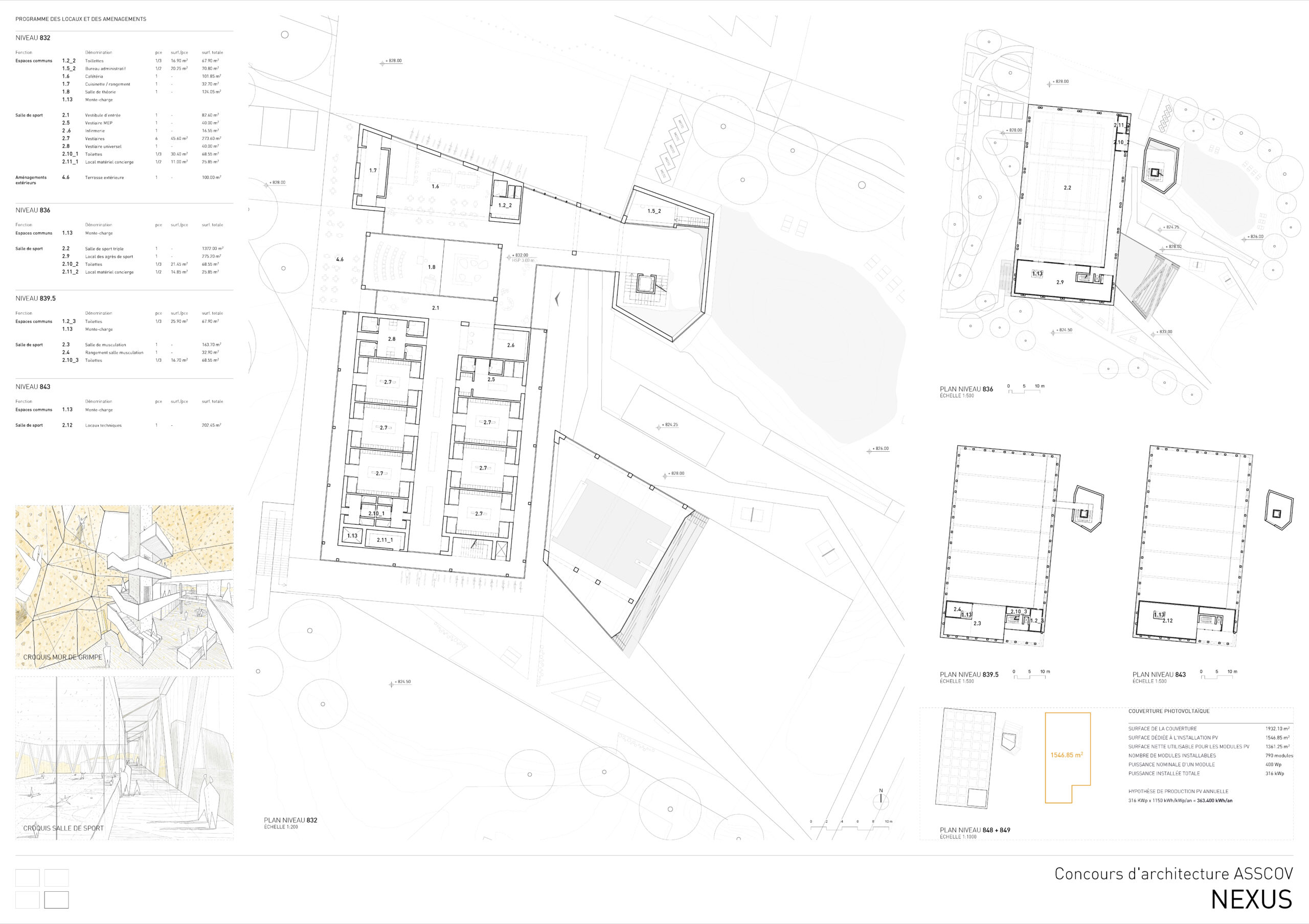
The gymnasium volume is slightly rotated relative to the underlying pool structure, and the interstitial spaces become opportunities for new pathways and areas to enjoy even when the center is not in use. Various compositional strategies are employed to achieve maximum integration and comfort within the 7,700 m² of spaces designated by the competition brief.
The design approach alternates a rigorous optimization of interior spaces with great creativity in the overall volumetric vision, supported by bold structural calculations to shape spaces that combine generosity and balance in the final realization of the community areas.
It is not only the alternation of voids and solids that defines the project’s interest, nor solely the compositional balance and harmony between materials. The project embraces contrasts and the succession of constantly changing perspectives that are not strictly connected to one another. The added value of Nexus lies in the architectural element conceived as a plaza- or landscape-oriented space, uniting distinct entities that would normally originate independently of one another.
The 3D images, both realistic and sketch-like, clearly demonstrate how these characteristics—both in the exterior and interior—create engaging perspectives between spaces. These perspectives maintain proper functional independence while allowing the possibility of engaging in one sport while visually connecting with another: from the outdoor public space, one can view the underground pool; from the gym’s balconies or bleachers, the lower exercise areas, the climbing volume, and the exterior are visible; the hall enjoys a privileged view of the climbing section that it partially encloses. Perspectives thus become special, interesting, and never predictable moments, defining the connections that Nexus projects from the city into the internal spaces.
Description
Design competiotion for a triple gym and swimming center in Châtel-St-Denis
In partneship with
noau studio design collaboration
Alpatec S.A. structural project
Promoter
Association of the municipalities for the lower secondary education cycle of the Veveyse
Area
Chatel Saint Denis (CH)
Year
2025
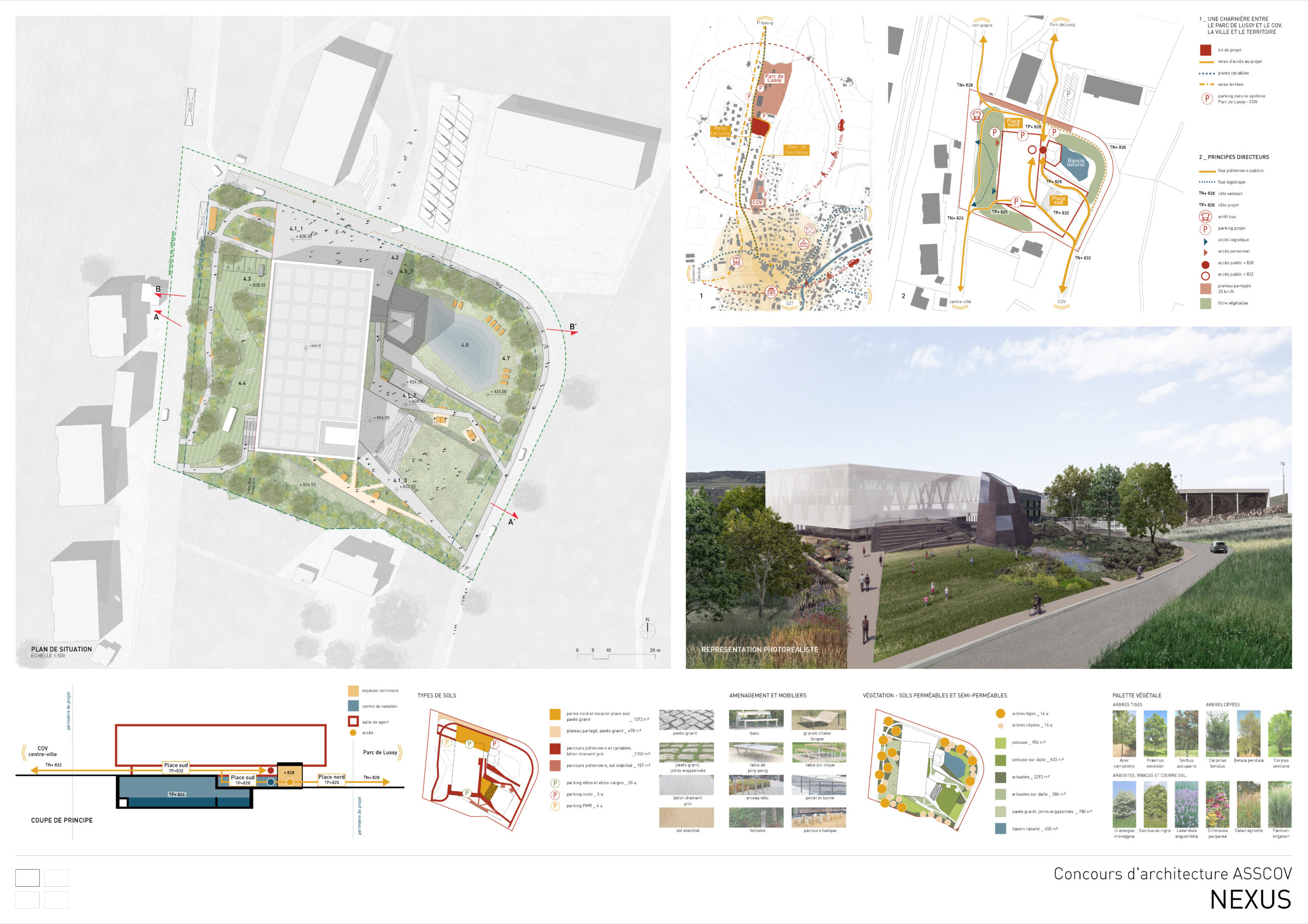
PANEL 1
PANEL 2
PANEL 3
PANEL 4
CRU . CAS


Competitions CRU . CAS: reconnecting points.
Castelfidardo is a small village with an historic downtown in the region of Marche. It still maintains an original urban scheme while its dynamic past life is slowing down in the present days.
The requalification project of the historic centre has as main target the improvement of the existing urban space without compromising the authenticity and the original attitude.
All the analyzed areas are connected by a common “fil rouge”: a reconnecting path that joins points of interest together not creating a new scenario, but a new urban balance where the potentialities of the places are expressed at their best.
The proposed urban furnitures are minimal, simple, sustainable, flexible and characterized by the red color in coherence with the planning regulation. The starting point (metaphorically and functionally speaking) is in “Porta Marina”, principal city entrance. The drivable flow is rethought relocating parking areas and terminals of autobuses and taxis. This change permits to enlarge the park area and the pedonal square with a new pavement where we find the new infopoint called “Il Mantice”.
The new expanded green square is connected through a new elevated crossing with an e bike storage at its end. This turns into the new city welcoming area and in this point the qr code tour starts.
The infopoint is a circular building with two completely different elevations: translucent panels in polycarbonate cover the red tubular metal structure on one side, while on the other side, the structure characterized completely the architecture defining the most flexible part used as relax area, playing area and events. On the rooftop we find an integrated photovoltaic system that permits electric energy production. This new multipurpose space can be utilized also for night events like videomapping and this is an opportunity to celebrate historical Risorgimental events projecting on the historic citywall where different layers of history are overlaped.
Continuing through Via Roma, the new cycling-pedestrian path, expanded and reviewed, becomes the linking elelement that enables to enjoy Castelfidardo passing through the requalified points till reaching Belvedere del Pincetto.
In this area the proposal is articulated with new flowerbeds integrated with the existing green and a new pavement. The new urban furnitures identify a rediscovered reading and snack area where you can realx and enjoying the sweet hills of Marche. This area is connected to a new scale that is located in the same place of the old one but it’s redisegned completely to create a “promenade” to access the historic centre. Trento Trieste square, characterized by 5 lindens, is utilized mainly as parking area. To change this scenario, we eliminate few parkings proponing a new pedonal path that connectes the existing sidewalk to one of linden. This becomes an occasion for “slow life” and break through the eccentric bench around the tree.
Finally the project focuses on the main square. This, by definition a social and sharing place, is actually a transit and stop area mainly for cars. The project, already approved by the admistration, provides the parkings outplacement and it is the starting point for the other proposed interventions: a new sandstone flooring is an inception between the existing porphyry with a lateral brick stripe as separation creating a path to emphasize the most important buildings. To complete this new floor, a lighting system on the sides is provided: embedded lights of the same size of a sandstone block. The Fisarmonica Musem, currently signposted with a banner affixed on the facade and barely visible, is provided with dedicated ground signs. A new white lettering system enriched the new floor, anticipates and intrigues the visitors from far away.
Wooden sittings are thouth as a modular and flexible system and can be used in different typology of the events by the comunity.
Description
Two stage National Competition
Promoter
Comune di Castelfidardo
Area
Castelfidardo
Year
2022-2023
Projectual interventions typology
Urban furniture, pavements, public lighting system
Cost
€ 1.335.000
Result
2° place

PANEL 1

PANEL 2

PANEL 3

PANEL 4
CRU . LAV


CRU . LAV Competiotion: adding through subtraction
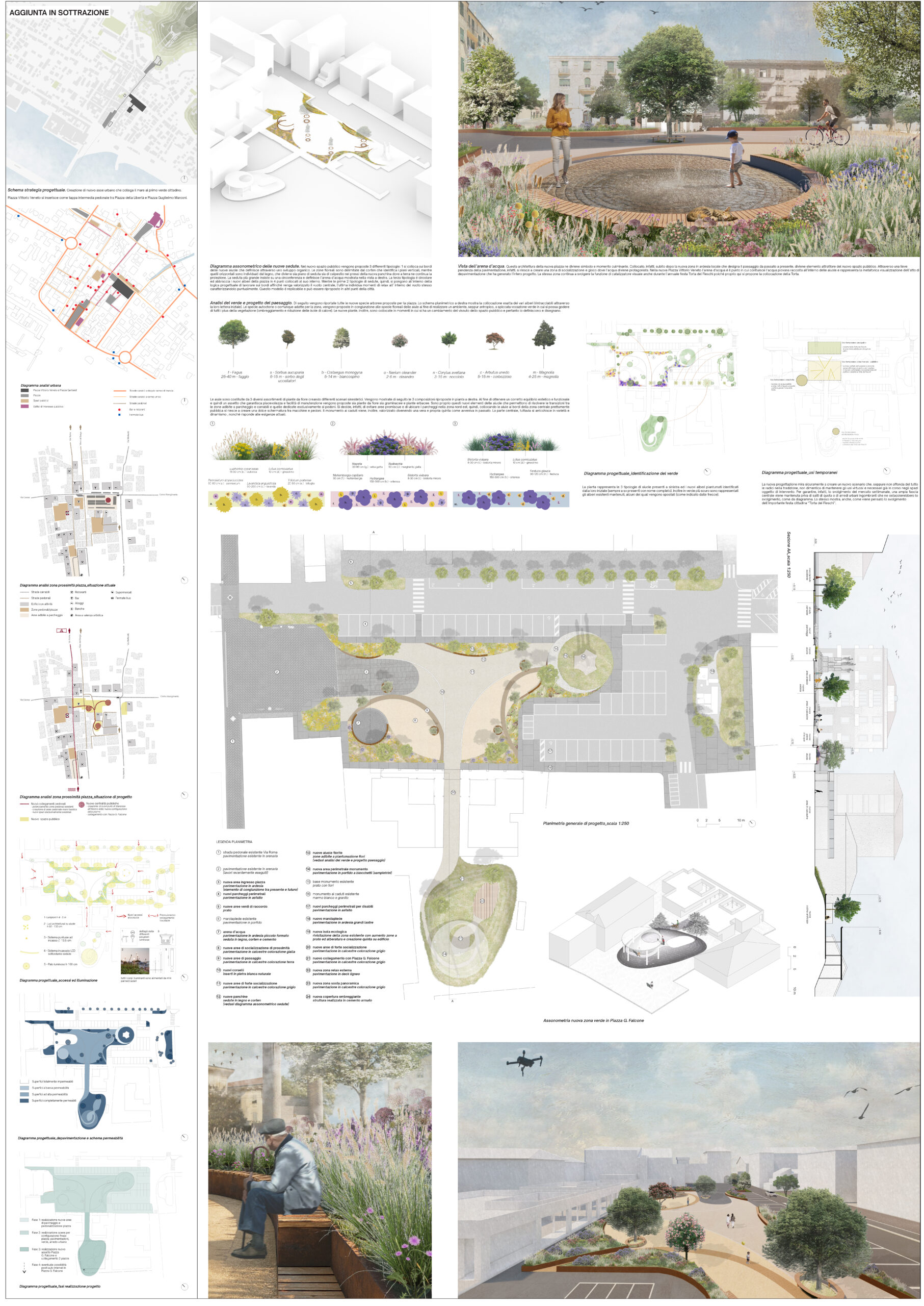
One of the main reasons why Piazza Vittorio Veneto is underused as a place for social interaction is the coexistence of vehicles and pedestrians throughout its entire spatial layout. This widespread overlap prevents visitors from enjoying the square through visual sequences that encourage people to stop and relax, since the central parking area remains visible from virtually every point. As a result, the surrounding buildings, with their façades, as well as the War Memorial, are not properly enhanced, while the urban void appears as an incoherent assemblage of different functions lacking hierarchy and clearly defined boundaries.
SUBTRACTION
Our design proposal originates precisely from these existing limitations. The first intervention consists of reducing the current extent of the square. Since the War Memorial naturally acts as a spatial backdrop (even during the Torta dei Fieschi festival, the stage is traditionally placed to the west of the monument), we have removed the area east of the memorial from the public square itself. This space, together with a portion of the northern edge, is allocated to parking, while the remaining area becomes the new square, transformed into a place for social interaction and community gathering.
This explains the title of the project: by subtracting part of the square’s current surface, we achieve a qualitative addition to the urban public space.
SPATIAL ELEMENTS
The project establishes a clearly defined hierarchy of spaces through a new edge configuration, where spatial elements are introduced to separate the newly created areas with different functions without acting as physical barriers or visual interruptions.
The new flower beds serve as ideal elements for separating parking areas from pedestrian spaces. Their height corresponds to that of a bench, ensuring uninterrupted sightlines and maintaining visual continuity. Positioned along the perimeter, they are complemented by integrated seating made of wood and Corten steel. Wood is used for the horizontal surfaces (the seat and walking surface), while Corten steel forms the vertical elements, retaining the soil of the planted beds.
The accompanying drawings illustrate the different typologies and the proposed plant species, as well as the location of the new trees and the relocation of existing ones that cannot remain in their current positions within the redesigned square.
An additional seating typology consists of circular benches placed around selected trees, further enriching the character and usability of the public space.
All new urban furniture has been carefully arranged to preserve a large open central area, allowing the square to continue accommodating the weekly market as well as major public events, most notably the Torta dei Fieschi festival, which takes place in the square.
DEPAVING
The new proposal builds upon the continuity between past and present while aiming to provide an improved vision for the future of Lavagna. In this context, a key contemporary challenge is addressing climate change through strategies that increase permeable surfaces, creating areas capable of absorbing rainwater during increasingly infrequent yet intense rainfall events.
The new green areas and perimeter flower beds are designed as fully permeable surfaces and are complemented by new public spaces finished in calcestre (stabilized gravel), further enhancing the square’s permeability.
In addition, the project proposes collecting rainwater within the planting beds for reuse in the irrigation of the landscaped areas.
SUSTAINABILITY AND ATTRACTIVENESS
The collected rainwater can also be channelled to become an attractive and interactive feature. To this end, the project introduces a new landmark that characterises the redesigned square, becoming both a recognisable and a distinctive element of the public space.
The Water Arena is conceived as a circular space featuring a gently sloping slate surface and a timber platform that provides informal seating. Here, water becomes the focal point of the square—a playful and engaging feature that also celebrates the sustainable water management strategy implemented throughout the project.
The proposal is sustainable not only because it improves rainwater management and drainage, but also through the use of locally sourced, readily available materials for the new paving. Slate and sandstone, both native to the area, reinforce the site’s identity, while the use of native or locally available vegetation contributes to biodiversity and helps mitigate the urban heat island effect.
URBAN INTEGRATION AND PARKING
The redesigned square contributes to a renewed and enhanced urban structure for the city. Piazza Vittorio Veneto is strategically located between Piazza Guglielmo Marconi—recently redeveloped and situated where the hillside meets the city near the Basilica of Santo Stefano—and Piazza della Libertà, which opens towards the waterfront.
Although the pedestrianised Via Roma runs alongside Piazza Vittorio Veneto, this axis, which should naturally connect these three important urban spaces, is currently underutilised. Pedestrians are not encouraged to enter the square from Via Roma and typically experience only the small western forecourt, beyond which the area is perceived merely as a large parking lot.
The proposed layout invites visitors to continue into the square, reaching either the Water Arena or the War Memorial through an attractive pedestrian environment enriched by flowers and vegetation. To create continuity between the existing forecourt and the newly depaved public space, the project adopts slate as the connecting paving material—a stone that embodies the continuity of the local landscape across past, present and future.
The intention is that pedestrians walking along Via Roma will naturally be drawn into this renewed public space by its distinctive paving and spatial character, which clearly differentiate it from the surrounding urban fabric.
Within the new layout, parking spaces are relocated outside the perimeter of the square along two of its edges. This solution is considered the most effective balance between cost and urban quality. As previously noted, the north-eastern portion of the site is less suitable for social interaction and is therefore allocated to surface parking.
The option of constructing an underground parking facility beneath the square has been dismissed at this stage because of its significant cost. Instead, investment is prioritised towards enhancing the quality, diversity and functionality of the public realm, including the introduction of a new lighting system, illustrated in the accompanying drawings and closely integrated with the proposed spatial layout.
However, within the proposed three-phase implementation strategy, the possibility of creating underground parking beneath the adjacent Piazza Giovanni Falcone remains open. The excavation material could be reused to form the artificial landscaped hill proposed for that square, creating a balanced and sustainable earthworks strategy.
PIAZZA GIOVANNI FALCONE
At present, Piazza Giovanni Falcone is separated from Piazza Vittorio Veneto by a block of buildings with arcades. Although the ground floor remains permeable, the two public spaces function as disconnected urban voids due to the lack of activity and attractiveness within Piazza Giovanni Falcone itself.
The new paving design establishes a central pedestrian axis that naturally leads visitors towards Piazza Giovanni Falcone, where a new artificial landscaped hill is proposed. This feature incorporates a panoramic viewpoint together with a lightweight canopy providing shade during the summer months.
Given the enclosed character of the square and its limited visibility and accessibility, this strong spatial intervention is considered essential to establish a new identity and breathe life back into the space.
CONCLUSIONS
The redesigned square represents an opportunity for meaningful urban improvement without sacrificing any of the qualities already present. The proposal respects recent interventions while preserving existing activities and patterns of use.
Ultimately, the project seeks to optimise the public space while introducing new poetic scenarios and a rich multisensory experience. It combines functional clarity with a strong aesthetic and creative vision, demonstrating that these qualities—often considered mutually exclusive—can successfully coexist.
The new Piazza Vittorio Veneto is envisioned as a tangible expression of this balance, where functionality, sustainability, identity and beauty come together to create a vibrant contemporary public space.
Description
Ideas Competition for the Redevelopment of Piazza Vittorio Veneto in Lavagna
Promoter
Comune di Lavagna
Area
Lavagna (GE)
Year
2025-2026
Projectual interventions typology
Urban furniture, pavements, new green system
Importo lavori
€ 710.000
PANEL 1
CI . RH


Competitions CI . RH: Revive Aia through Landscape
The proposal aims to define a new housing model in a rural context redeveloping Cascina Lossano.
The “aia” is redifined through a new landscape drawing and the private spaces are organized and connected by collective spaces that are protagonists.
Our renovation would be not only a refurbishment of the blocks, but also a new rural vision/model. The existing old blocks with their rural background find a new life in a masterplan where public and private spaces speak together through new green areas and external facilities layout.
There is a common design approach (every apartment is opened towards the common area with big windows and rooms/services are connected to the private spaces) but every block is characterized by different materials and features. These design details differentiate the apartments creating a large market offer.
Green, water and path design help to enrich the final perception of space and future inhabitants can find a urban system like in the historic villages where housing and nature create a good living balance.
The flow distribution is an alternance of direct routes and fluid paths: buildings are connected or distanced by these elements.
The secondary path runs along the artificial river and arrives to the “greenhouse” block, located behind the block C backdrop.
The model proposes a residential scheme enriched by services and multipurpose spaces. These can be used by the residents or for external special events.
The “greenhouse block” is the pivot element serving the new swimming-pool and hosting a coworking space and a bar/restaurant.
Description
International architectural competition
Promoter
TerraViva Competitions
Area
Sant’Alessio con Vialone (PV), Pavia, Italia
Year
2023
Result
Featured project

PANEL 1

PANEL 2
CI . KL


CI . KL competiotion: project for emergency.
The ideas contest theme is designing a centre to deal with emergencies. The call is for a modular solution to be built with a low budget. It has to be flexible for different typologies of emergency. The spaces, after the emergency time, have to be reconverted for other community needs. Easy mounting structures and simple technologies were preferred.
Our proposal shows 4 timing phases that permit to pass from emergency to a new life era. Every phase represents a different modular configuration of the center. In the first one ill people are separated from healthy people, after this the medical system becomes more structured for the medical treatments till the final new life configuration when the center can host a school or events.
The project materials are gravel, earth bricks, earth rammed walls, wood, bamboo (easy to find and to adapt) and are used to create a frame completed by colorful textures and fabrics to make the architecture more pleasant. The roof is a metallic layer.
The modular composition is made by repeatable cells with a different final configuration through the joining method, the alternation of voids and fulls and the different roofs. The final phase is also characterized by a circular earth rammed wall.
Every single architectural element wants to represent an action to be copied in an emergency phase: the project has to be fast and effective, beautiful because resolutive today like in every possible future scenario, possibly a better one.
Description
International architecture competition
Promoter
Kaira Looro, Architecture for Peace
Area
Africa sub-sahariana
Year
2020
B . V house: red birch
“I start a project when I visit a place.”
This quote by Siza represents our design philosophy, and in particular, reflects the approach behind the project CASA B.V. In this case, the process even included the selection of the property itself (purchased with the intention of becoming our home). The trapezoidal floor plan, offering unusual perspectives, the L-shaped terrace, and the modest size but high potential for layout reconfiguration immediately gave us the sense that this was our home—or rather, our next challenge.
Right after the viewing with the real estate agent, we both already had design ideas and compositional choices in mind—ideas that persisted all the way to the construction phase: demolishing the partition between the living room and entrance to create a large and unusual open space, and exposing the concrete beams and columns.
These initial certainties became the foundation for everything else, in a design process that diverged from the usual path, with many decisions being made directly on-site.
The goal was to gain an additional bedroom compared to the existing layout (the reason we decided to move in the first place, following the birth of our daughter Dalia).
To achieve this, we made two key and unconventional choices:
-
A non-linear layout for the sleeping area, separating the shower space from the rest of the bathroom.
-
The kitchen placed directly after the entrance.
The upper kitchen cabinets are aligned beneath the beam, and where the utility closet used to be, we introduced three furniture blocks serving as wardrobe, fridge, and oven column. None of the compromises typically made with private clients were accepted in this home—every choice here becomes architecture, with playful yet deliberate determination. Yes, we were radical, but with a strong sense of play, we began to enrich a minimal and clean canvas with elements full of warmth and personality.
This design direction started with the parquet flooring, used in the open space and both bedrooms. From this relatively conventional material choice, we developed unique applications. In this project, the parquet is not used to unify but to characterize individual spaces. In the living area, we chose light oak laid in a running pattern, with dark wood inlays that gently add rhythm and geometry to the space, creating visual anchors where everything else is about misalignment and surprise. If the first theme comes from the inherited spatial conditions and is an unavoidable element, the second stems from a desire to introduce playful and unexpected details—such as the use of red for all “warm” components: the radiator in the living room, the conical pendant above the table, the kitchen faucet handle, and the exposed heating pipes.
The choice to reveal the structural and constructional elements enhances the sense of spatial openness, alongside the repeated use of white and wood. Birch—a light wood full of character—emerges as a key protagonist in the project.
It first appears in the handmade recessed circular handle of the kitchen, the drawer interiors, the exposed plywood in the bench/living room furniture, becomes the countertop for the bathroom sink, and reaches its peak in the master bedroom. Here, the parquet transitions into a tatami-style floor (Fabrique by Listone Giordano), creating a visual perspective that culminates in a bed headboard made entirely of birch plywood. Both on the horizontal plane (the Fabrique is made of cross-cut birch slats) and the vertical headboard plane, the birch expresses itself in its full relaxing yet dominant essence.
This clean and slender headboard volume hides the wardrobe in the master bedroom, eliminating the need for a conventional closet.
Oak flooring returns in Dalia’s room, where the wardrobe is both generous and minimal at once. In this space, the aesthetic strength of the bleached fir window frames—with flush-mounted frames and a single-leaf opening of 1.6 x 1.6 m—is even more appreciable. A large colorful rug, a play kitchen, a birch bookshelf nook, and a bed shaped like a house archetype are the protagonists of this room, where color and playful juxtapositions reign.
If all of the above makes an impact upon entering Casa B.V., we believe the true compositional and design refinement reveals itself in the least celebrated space—the corridor and circulation area connecting the living space and bedrooms. The geometry we designed allowed us to avoid placing a door between the open space and the sleeping area. The large-format white porcelain tile elegantly and neutrally connects the three different parquet zones. Almost imperceptibly, it becomes a backdrop while also highlighting the full-white bathroom, where even the matte white fixtures and faucets, along with a side mirror, help visually expand the compact space—setting the stage for the bold black shower cube. This, too, is inserted in contrast, much like the LED lighting in the open space that touches the raw concrete beams. Even the corridor is not perceived as a mere transitional space but as a minimal, subdued environment that allows the other rooms to shine. Naturalness also comes from the bold decision to separate the shower from the bathroom and to further enhance the non-orthogonal nature of the spaces.
We made the decision to incorporate into our home all the things we’ve experimented with over years of practice—things that bring us joy and well-being—because we believe this is what truly leads to livable, functional spaces.
By pushing this concept further, we’ve experienced firsthand what we hope to convey to others. The use of custom design—at a time when many technical and technological needs are already met by off-the-shelf components—allowed us to make the most of every square meter.
If the challenge of architecture is to create unexpected spatial qualities while preserving a sense of comfort—finding rules and skillfully playing with their opposites—then CASA B.V. stands as a unique interior architecture project, in a distinct shade we like to call red birch.

CM . IA house: a rational revolution.
At the end of 2020, in the bolognese countryside, the new construction of a detached house with a private garden and close to a public park started.
We were contacted to deliver an interior design projects but after a first meeting with the clients, we proposed also to review the general layout having a new one where the furniture will be protagonist of a strong spatial change.
We had a generous volume under a double pitch roof with a consistent slope, so we started working in section and we proposed a new mezzanine.
We thought a complete spatial integration where the upper level becomes a natural expansion of the living room at ground floor and we declined the “promenade” theme as a succession of backdrops.
The spatial revolution is based on a rational sequence of volumes that create visual backdrops and hide the classical connective and functional systems.
The staircase is incorporated in a sterometric volume and is visible frontally from the entrance while from the dining table the backdrop that we can see is the kitchen. The large green grey wall system also divides the living area from the sleeping area and creates an elegant and modularly balanced base that supports the light mezzanine with the wooden roof.
Purity, refinement and linearity are the values of living that the project wants to express and that are witnessed by the wood essences, colors, the lacquered furniture and the architectural details that we find punctually in the various areas. The wood is present not only in the laminated roof but also in the visible cubes of the cupboard, in the staircase and in the details of the handles.
After the long equipped wall we find ourselves in the sleeping area where the doors flush with the wall at full height define the cleanness of the connections and guide us to the bathroom that concludes the succession of the scenes identifying itself as the last and most precious among them for peculiarities of details and materials. The theme of this space is “inception”: small gold inserts enrich the materic grey gres on the walls and the shower glass is shaped on the top that supports the two circular bowls.The satin gold faucet fits elegantly but gracefully into the space and the light bodies also complete this picture in which the containment becomes an opportunity to balance the horizontality of the top with the verticality of a wooden volume with ribbed finish. Even in the rooms we find custom-made furniture in colors ranging from light blue to dark blue and that are combined with the warmth of wood.
The furniture in this project is real architectures and not just decorative elements: they define the space becoming connecting elements, alternating moments they hide with others they reveal. Going in this direction we have not only the mentioned staircase-kitchen module, but also the white cupboard that is filtering the entrance with the garage and is also a coat hanger, while the kitchen is in relation with the bedroom armchair and the plasterboard volume on the top of it that hides the suction system. In the mezzanine, we used the column to divide the relax area from the small office and the connection is done by an L scaped custommade piece of furniture .
The furniture pieces are like bodies that lie on a grey background and they are clearly cut by the zenithal lught coming from the velux in the roof. In this project is renovated the eternal play of the architectonic narration done by radical choices, compromises and playful experience to reach our rational revolution.
Casa B . CL: a playful optimization.
In Bologna Meloncello area, near the city stadium, a minimum size apartment with an unpredictable future has been transformed balancing shapes and colors.
47 sqm can expand perceptually if the right decisions are taken without giving up to a playful experience. How can it be possible? First of all transforming an hallway into a kitchen, then designing a piece of furniture made by solids and voids, along a structural portal transformed into a double archway.
The apartment spaces weren’t adequately exploited, so the layout was redesigned eliminating two main elements: the long entrance hallway and the tiny dining room. This wasn’t used because too small, the only heating system was an old stove located on the left close by the entrance, on the wall that divided this space from the living room. This wall was demolished and a new structural portal was created. To have an hall and a wardrobe in a single piece of furniture, we designed a customised closet that also frames the kitchen having a playful role.
Through it, we have been able to maintain the new openspace and to have a functional volume collocated between the two arches.
We decided to not express the structural frame and we have used plasterboard to create two arches with a small central area where the “hole furniture” is located becoming a double face element: from one side is shoe rack and closet and on the other side the final element of the kitchen.
The apartment has been equipped with heating and air conditioning system, sections of the floor were removed allowing the passage of electric and hydraulic system and the parquet was placed on top creating a warm background for the new plastic and colorful volumes.
The elements that could have formally spoiled the project, became instead an opportunity to characterize it. So the old hallway between the bathroom and the bedroom, was reduced to have the new laundry expressed by a clear blue volume to hide the misalignment between the walls.
The two arches have been designed to pass seamless from hall to living room and kitchen delimiting softly the spaces and the void of the entrance furniture let you look the kitchen being also a seating area.
Functionality and play coexist together with shapes and colors. The bathroom, revised and re-proportionated, becomes a mediterranean ambient where the brightness of the small white listels exalt even more the white and blue geometries of the pavement.
B.CL house is an house that reflects the personality of its inhabitant: a young designer that projects without forgetting the importance of play and smile.

B . RE house: compositional balance reformulation
Close by Giardini Margherita, in a great value building, our work has involved an apartment resulted by a fractionation with the scope of a new layout for the resulting spatial configuration.
On the same floor, in the past, a dwelling and a dental clinic coexisted covering 300 sqm. The entire laboratory and part of the dwelling, previoulsy totally inhabitated by the mum of the client, have became the new home of a young couple. At the end of the works mum and daughter share the same floor with a fair split of sqm for the two indipendent apartments.
The generous openings and the elevations modularity were thought for old spatial proportions, very different from the new resulted ones. Harmonizing elements from a past with generous openings together with new spatialities was the challenge.
After a removing process of additional elements that weaken the openings visual, the existing becomes a neutral and minimal background where some thought perceptive inceptions became the right neutral and gorgeous backdrop. Here numerous perceptive inceptions become the right telescope for external glimpses.
Following this strategic-projectual strategy, we have propose the portal between living room and kitchen that not only divides without splits, but also makes new frames and helps to define visuals on the existing openings. Without renuncing to the functional need of storage, this piece of furniture designs new perspectives that enriches the space becoming a silent protagonist. The choice of the white lacquering and birchwood create a light backdrop that doesn’t interfere with the darker essences of the existing maintained windows and parquet.
We ended up with a spatial articulation where kitchen and living room are always connected without having primary and secondary viewpoints.
In the kitchen are the sky blue customized furniture that becomes the prospective protagonist. This piece of furniture with an rounded corner, through the reeded finish, makes a pleasant backdrop.
The laundry area and the bathroom are identified by the “green” incursion. In this case the target is identified a new scenario that is still connected to the past through chromatic similarities as in the balconies. In a poetic where connections and differentiations are alternated, the lacquered green doors in the laundry are joined to the cabinet in the bathroom through an enjoyable aestethic touch and the gres coating makes a continuous surface as an elegant dress under an intense light.
The project was mainly focused in the spaces shown in the photos, but the refurbishment includes also the new studio and the clients’ bedroom with the private bathroom.
This challange of union withouth a complete fusion and of respectful incursion make a new spatial alchemy that defines the new identity of B . RE house.
B . FE pub: Felsinean synesthesia
The new The Rocker Inn is not the “former Circolo Pickwick,” because even though it occupies the same physical space of the first historic pub in Bologna, it has changed not only its name but also its essence.
Commissioned by the new management, Estragon, to give stylistic and material form to this desire of transformation, we began a process of subtraction, research, and juxtaposition in order to bring The Rocker Inn to life. Certainly, the venue could have remained as it was—but if one changes the name, identity, and wishes to create a new atmosphere, then the appearance must evolve as well. However, change does not mean erasing the past. Recent managements had failed to grasp and enhance the richness of these historic spaces, and these walls had merely become “old.”
From these premises, the challenge of a collective renovation began—minimal in its final appearance, but deep in its principles. Some elements, of course, had to be preserved because historic, elegant, irreplaceable, and beautiful. Starting with the unchanged stained-glass door, the wood-and-marble bar counter with its solid wood back framed by arches and mirrors, and the multicolored tile flooring with a fine red-and-black terrazzo, we began to reflect on what could be altered and added.
Although character-defining and central, the bar counter seemed to close off the space too much. We realised it could be retained but slightly modified. Removing the portion with the “saloon-style” doors (clearly a later addition), we opened the view up of the courtyard, which had been waiting to host a stunning floral arrangement.
The property’s restriction—preventing public access to this area due to acoustic concerns—further encouraged us to emphasize its role as a green backdrop and as a visual lightener.
The rooms adjacent to the main hall once seemed dark and gloomy to many patrons. Few ventured beyond the bar area, as the small back rooms didn’t invite use. The new framing—with exposed carpentry—now creates a generous space that connects the two old rooms, which still remain more secluded than the first hall.
Thus, from the entrance, one can now glimpse the outdoor garden in a design that visually connects three spaces through an elegant sequence of layered scenes. The exterior reappears in a crescendo of intimacy and serenity, starting from the portico of San Felice, moving into the welcoming warmth of the main pub area—genuine and lively—and then into the more secluded, introspective tea room, which introduces the Zen calm of the internal patio. This alternation of spaces is tied together by materials, colors, and the evocative qualities of objects.
Another bold choice was to leave the red wall raw—revealing the building’s original use as a slaughterhouse. For years, wooden slats had concealed this rough beauty, which has now returned to the light.
The previous ceiling’s garish acid green/blue tones and its white map of Bologna were replaced by a darker green that, along with the old red of the metal frames, creates a natural binding tone. Customers have skillfully added paintings, repurposed furnishings, and tartan wallpaper for the vinyl corner. All this coexists with CHEAP prints, thoughtfully positioned.
The new managers embraced the suggestions to open up the visual space, to reimagine the spatial experience, and to stay true to the venue’s history—respecting the valuable elements—while also making it their own: a place where they can share what they love with their guests. And so today, flavors, scents, and new music intertwine daily in the Felsinean synesthesia of The Rocker Inn.
CS . P house: welcoming and vivid two tone essence
In the area Croce di Casalecchio, in Bologna the transformation of an apartment with a not optimized layout ended with a new spatial custom configuration that fits the simple and decided needs of the client.
We have focused from the start on the theme of the entrance characterization. It had big dimensions and was nearly unused. The project creates a colorful linear initial space characterized by a long wardrobe that overcomes the classic concept of entrance having a trade de union element that links the hall to the kitchen.
The only way to not waste important meters having a stylistic coherence in the entire living are was creating a new open space where, through the use of the costume mede furniture, the areas are joined together pleasantly.
As soon as you step inside the space, the linear two tone piece of furniture drives the eye to the french window in the kitching/living area. This lighting backdrop attracts and makes the visitor analyzing the rest of the space secondly.
The two tone blue and white is the fil rouge that we can find from the hall, passing through the kitchen that has a top in quartz and blu color low modules, and arriving to the bathroom with its entrance. The division between entrance zona and kitchen is identified by a portal that connects living and sleeping area framing the entrance furniture of the bathroom.
In a neverending colorful play, where the tones reappears also in the bookshelf pieces, the functions remain but are lost at the same time and the flue is the opportunity to have shelves extending the kitchen and creating a perceptive filter.
The bookshelf bends creating a curved piece through the living room where behind the sofa, the table enjoys the light from the french window.
The blue from the bottom part of the living room conquers the entire furniture that is at the entrance of the bathroom, where the volume is made lighter by the shelves and focuses making an invitation of the bathroom. In this space beige tone are mixed with green and oak. The apartment is showed lived and colonized by the client: the guardian and user of this welcoming and vivid two tone essence.
B .I house: a gentle meeting of visions
B.I house is a “bolognese” space that welcomes without showing off, an apartment with smart and sensitive changes aiming to maximize the potential of the existing space.
The project expresses some themes that are very important for the practice research: the maintenance of valuable elements, legacy of the past, without losing the renovation opportunity. The additions are resolute and functional with modern components that are impressive and simple at the same time giving a minimal and warmth touch.
This is visible from the entrance, where vintage second hand mirrors with gold frames stand out on a raspberry plum wall. On the right an elegant portal drives to the openspace: a bivalent ambient with the kitchen on one side and the living room on the other. The two areas are highlighted by a change in materials: the linear kitchen is connected to the rustic gray cement finish over terrazzo gres flooring that replaces the ancient parquet just in this area. The wall finish passes from cement to wallpaper reaching the other side of the room with the custom bookshelf faced by the green sofa.
In the bedroom the wallpaper covers also the bed head wall fading into the intense blue ceiling. This intimate space is completed by the full height white wardrobe and some vintage furniture.
The bathroom is a surprising space with a great material combination of “cocciopesto” and big size gres tiles with green tones inspired also by oxidized copper. The “cocciopesto” is an antique tecnique based on lime that has an unequal and materic finish and this style goes on in the space with the textured tiles till meets the shower divided by a minimal and modern cristal slab.
The cement top is in conjunction with the kitchen one. It makes the base for the oak piece of furniture and the ceramic white oval bowl.
To complete the picture, we find arch shaped mirrors that create a playful and smart corner integrated with the lighting system.
Minimalism and warmth, essenziality and decor join together in the house where Ci has met MA and where they currently live.
B . P house: the power of respect.
This intervention has involved an apartment in Santa Viola area in Bologna. Located on the last floor of a ’60s building, it has remained as originally designed. The needed modifications permit to rent the apartment: we have operated just on the shell and the internal finishes while the furniture choice was left to the future tenants.
The main target was respecting and valuing the consistent heritage of the place: polychrome marbles, custom furniture and generous spaces were maintained and developed through a careful mending of the new voids to give new life to this elegant apartment.
In the living room we had to maintain the yellow Siena marble, the old wood frame door single glazed and the oriental bar closet.
We have eliminated the grey wallpaper, the maintained elegant door stands out resilient and smart and you can overlook the new kitchen. Close to it, we have created a new hall that was detached in the past and gives now a simple new touch to the house.
The kitchen space and the dining room perfectly represent the theme of the intervention: although often the change is hidden or covered to let the new comes, in this case the past is underlined and expressed strongly because it has the same design importance of the modern parts.
Different materials are joined together: the existing marbles are connected by the new gres pavement with metal effect and the final status is a renovated balance where different layers coexist in a dynamic configuration.
The kitchen, in coherence with this approach, doesn’t hide its modern and new status being placed over a new dark piece of pavement.
Light, simple and not protagonist as the power of respect.
In the bathroom, as the client requested, the old yellow mosaic is maintained and the new dark gres is joined to it: the final result is a new bathroom with a vintage flavour.
This project reflects our approach that targets to valorize the existing if, after analysis, is judged as interesting and integrable. We like using new techniques and materials to create interesting mixes with the elements remaining from the past to express our personal creative result. The limits become enrichment to create a new scenario where past and present are joined in harmony.
B . N house: don’t move, improve!
Bologna citycenter, Via Nosadella, a young couple is waiting for the second son in a special and welcoming house but small, with a weird layout and a not fully utilized patio.
Changing apartment and leaving all the memories awayto explore new horizons should seem the right solution, but would it be really impossible remaining in a readapted space?
Maybe no…but a bathroom sholud be canceled and it seems “almost” impossible adding a shower to the remaining bathroom.
We work on this “almost” to have a bespoke project that shows how sometimes the first choice is not always the resolutive ones.
In the new layout the children bedroom becomes bigger including the space of the deleted bathroom and it is enriched by new simple and colorful pieces of furniture that makes Bea and Ale’s bedroom a playful space.
The remaining bathroom should be gifted with shower. The choice is adding a new green block. This element represents a strongly characterized and characterizing add connected to a pavement change: a new transition area is created.
The intervention, as in other our projects, is clearly expressed, it is not hidden and becomes a possibility of chromatich enrichment.
The resistence inhabitative act is expressed recalling a poetic where the intervention finds an exact place in the existing space.
If outside the volume is sharp and smooth at the same time through the green color, inside the pure white becomes the protagonist together with the organic drawing that connectes shower and washbasin. If the line seems simpering forstly, it’s the most optimazed spatial way to solve the space.
Brightness and minimalism are targeted through white listels and alternation of concave and convex surfaces that create light games and reflexes in the shower. An extended mirror surface and a bespoke piece of furniture with a final birch panel on it complete the curve in a system that seems almost suspended inside the green space.
Custum furniture is drawn not only in the living area and in the bedrooms, but also inside the new “pergotenda” in the patio. Inside the grey furniture under the “pergotenda” not only clothes are washed, but also some mornings, Matteo shaves the beard.
Also this small behaviour showes us how much the clients would stay in the aprtament…where everything remains and everything changes.
B . C house: the minimal adornment.
Changing without making it notable and being minimal could be a choice and it often represents a trend in the last years. In this case we have faced a real necessity to make our intervention minimal but snappy.
The apartment is located in one of the most beautiful areas in the downtown of Bologna, close by Porta Castiglione. The strange shape is connected to the central court and this affects the interior design.
The house was already completed and functional, but the clients wanted to completely review it to feel it really their home. To reach the target we have operated on furniture, coatings and lights without losing the main target of minimalism. We updated an apartment belonging to the past toward the modern needs of a growing family: the conditioning system has been added, we have rethought the living room and completely changed the private bathroom of the master bedroom.
The elegance of the apartment is the same of our clients, which allowed us to preserve the main essence of the spaces celebrating them with strong and brave decisions.
The cement sink is the synthesis and the manifesto of this approach. The bathroom is narrow and long , with all out of square walls, so we have introduced an organic and monolithic object: a custom cement sink designed by us completely shaped on the surfaces of the space. It is an unicum not only for material but also for its shape.
We have started from this object to apply the minimal adornment to the entire bathroom: big size grey tiles on the floor to create a neutral and uniform background to host the monolith. Matt and shine small white triangular tiles on the wall that are reflected by the two mirrors to enlarge the space.
The same approach has involved the furniture in the living room (partly bookshelf and partly food storage) where the voids left from the old intervention were used and joined together by a white and minimal basement/sitting area.
The valuable spaces are carefully illuminated by the new materials: in the external patio the new light pavement helps to enlight the space. New lights are introduced to fill the lighting gap of the apartment.
In this case doing exactly what it was necessary and nothing more was essential to reach the minimal adornment.
CP . SC house: Maremma 110.
We could sum this project up with two words: Maremma and 110. An old cottage built at the end of ‘800 in Castiglione della Pescaia was retrofitted by an intervention of Superbonus 110 to have an energetic update.
The rural complex was made by a two storey house and an old stable converted into a warehouse.
Our intervention has involved the second floor of the main building, reshaping the apartment layout and optimizing the space. The main demolition has involved the additional suspended ceiling that wasn’t part of the original building and through the ages has covered the wonderful wood beams and lowered the space.
The new hybrid heating system is connected to the photovoltaic one installed above the stable roof allowing to heat up and cool down the new spaces of the bedrooms and the new openspace that not only has doubled the area up but has also increased the volume with the new heights.
The perimetral loose masonry has been consolidated through the “betoncino” technique and thermally insulated with an internal new layer.
The same insulation has been added under the roof , the division between living room and one of the bedroom has been demolished along the addition of two more bathrooms.
The retrofit and modernize challenge for an historic building of Maremma with no foundations has permitted us to face the theme of the existing in a completely new environment giving us a great motivation to reach the final result.
Outside the building retains the same brick aspect that represents it from the construction and permits the landscape integration, inside the intervention shows its contemporary essence.
A new continuous pavement becomes a connecting element for the spaces that are defined with different materials, styles and colors. Reused furniture and new lighting elements create this unique balance, reflecting the spirit of this holiday house in Tuscany where the clients from Rome and Bologna go to enjoy their relax moments during the year.
We have maintained and brought to new life old parts of the existing architecture, supplying what the owners needed to enjoy these renewed spaces.
This intervention represents an example on how the architectonic act preserves the past making the spaces suited for present and future uses.
R . AS center: the color space.
This project is identified as restyling of a medical center.
The main challenge was making more pleasant an area of the center attached to the main part in a second phase.
The target has to be reached with a low budget and without changing the layout.
Color is the real protagonist.
Can color define the space?
Color can create perceptions so it could define spaces. With a small budget, we have managed to give more depth and pleasantness to the connecting spaces and to the gym bringing back peace and balance inside the physiotherapy boxes.
The other important element was the light. In the corridor we have changed the disposition of LED lights to have longitudinal direction and to be in coherence with the new color bands.
Lights and colors are joined together to give new life to spaces that had just a functional essence before and are playful and interesting now.
The dark ceiling has been eliminated in the boxes to avoid that these small spaces could appear even smaller and the lighting system completely reviewed with a lateral lighting cut and new minimal spots on a track.
Balance and right color selection, in coherence with the merchandising, were the main actors of the restyling with the simple, but radical intervents too.
Our final answer is clear: color could be space and space could be color.
CI . KL competition: project for emergency.
The ideas contest theme is designing a centre to deal with emergencies. The call is for a modular solution to be built with a low budget. It has to be flexible for different typologies of emergency. The spaces, after the emergency time, have to be reconverted for other community needs. Easy mounting structures and simple technologies were preferred.
Our proposal shows 4 timing phases that permit to pass from emergency to a new life era. Every phase represents a different modular configuration of the center. In the first one ill people are separated from healthy people, after this the medical system becomes more structured for the medical treatments till the final new life configuration when the center can host a school or events.
The project materials are gravel, earth bricks, earth rammed walls, wood, bamboo (easy to find and to adapt) and are used to create a frame completed by colorful textures and fabrics to make the architecture more pleasant. The roof is a metallic layer.
The modular composition is made by repeatable cells with a different final configuration through the joining method, the alternation of voids and fulls and the different roofs. The final phase is also characterized by a circular earth rammed wall.
Every single architectural element wants to represent an action to be copied in an emergency phase: the project has to be fast and effective, beautiful because resolutive today like in every possible future scenario, possibly a better one.
Competitions CRU . CAS: reconnecting points.
Castelfidardo is a small village with an historic downtown in the region of Marche. It still maintains an original urban scheme while its dynamic past life is slowing down in the present days.
The requalification project of the historic centre has as main target the improvement of the existing urban space without compromising the authenticity and the original attitude.
All the analyzed areas are connected by a common “fil rouge”: a reconnecting path that joins points of interest together not creating a new scenario, but a new urban balance where the potentialities of the places are expressed at their best. The proposed urban furnitures are minimal, simple, sustainable, flexible and characterized by the red color in coherence with the planning regulation. The starting point (metaphorically and functionally speaking) is in “Porta Marina”, principal city entrance. The drivable flow is rethought relocating parking areas and terminals of autobuses and taxis. This change permits to enlarge the park area and the pedonal square with a new pavement where we find the new infopoint called “Il Mantice”.
The new expanded green square is connected through a new elevated crossing with an e bike storage at its end. This turns into the new city welcoming area and in this point the qr code tour starts. The infopoint is a circular building with two completely different elevations: translucent panels in polycarbonate cover the red tubular metal structure on one side, while on the other side, the structure characterized completely the architecture defining the most flexible part used as relax area, playing area and events. On the rooftop we find an integrated photovoltaic system that permits electric energy production. This new multipurpose space can be utilized also for night events like videomapping and this is an opportunity to celebrate historical Risorgimental events projecting on the historic citywall where different layers of history are overlaped.
Continuing through Via Roma, the new cycling-pedestrian path, expanded and reviewed, becomes the linking elelement that enables to enjoy Castelfidardo passing through the requalified points till reaching Belvedere del Pincetto. In this area the proposal is articulated with new flowerbeds integrated with the existing green and a new pavement. The new urban furnitures identify a rediscovered reading and snack area where you can realx and enjoying the sweet hills of Marche. This area is connected to a new scale that is located in the same place of the old one but it’s redisegned completely to create a “promenade” to access the historic centre. Trento Trieste square, characterized by 5 lindens, is utilized mainly as parking area. To change this scenario, we eliminate few parkings proponing a new pedonal path that connectes the existing sidewalk to one of linden. This becomes an occasion for “slow life” and break through the eccentric bench around the tree.
Finally the project focuses on the main square. This, by definition a social and sharing place, is actually a transit and stop area mainly for cars. The project, already approved by the admistration, provides the parkings outplacement and it is the starting point for the other proposed interventions: a new sandstone flooring is an inception between the existing porphyry with a lateral brick stripe as separation creating a path to emphasize the most important buildings. To complete this new floor, a lighting system on the sides is provided: embedded lights of the same size of a sandstone block. The Fisarmonica Musem, currently signposted with a banner affixed on the facade and barely visible, is provided with dedicated ground signs. A new white lettering system enriched the new floor, anticipates and intrigues the visitors from far away. Wooden sittings are thouth as a modular and flexible system and can be used in different typology of the events by the comunity.
Competition CD . CDS: nexus a urban sport facility.
The new sports complex, consisting of a triple multi-purpose gymnasium and a swimming center to be built in Châtel-Saint-Denis, a small Swiss village in the Canton of Fribourg, becomes an opportunity for a new urban vision. The design proposal presents not only a new building, but also the development of a public space that originates from the layout of the new sports center, aiming to create a fully integrated urban environment.
By analyzing the topography, the idea emerges to place the swimming center entirely underground, while its roof becomes a green roof that hosts a public stepped seating area, creating a space for the community. This area is surmounted by the translucent polycarbonate volume of the triple gymnasium, built with a significant timber structure that strongly contributes to the overall aesthetic definition of the new center.
The complex is completed by a prism with a metal cladding, housing the climbing gym, which becomes a landmark and defines the entrance hall of the center. It completes an area of the city with a strong sporting vocation and establishes a connection with the adjacent COV center.
The outdoor swimming pool, located near the climbing block, is set within an existing depression and, like the other parts of the complex, contributes to a “natural” integration within the overall context of the project.
The gymnasium volume is slightly rotated relative to the underlying pool structure, and the interstitial spaces become opportunities for new pathways and areas to enjoy even when the center is not in use. Various compositional strategies are employed to achieve maximum integration and comfort within the 7,700 m² of spaces designated by the competition brief.
The design approach alternates a rigorous optimization of interior spaces with great creativity in the overall volumetric vision, supported by bold structural calculations to shape spaces that combine generosity and balance in the final realization of the community areas.
It is not only the alternation of voids and solids that defines the project’s interest, nor solely the compositional balance and harmony between materials. The project embraces contrasts and the succession of constantly changing perspectives that are not strictly connected to one another. The added value of Nexus lies in the architectural element conceived as a plaza- or landscape-oriented space, uniting distinct entities that would normally originate independently of one another.
The 3D images, both realistic and sketch-like, clearly demonstrate how these characteristics—both in the exterior and interior—create engaging perspectives between spaces. These perspectives maintain proper functional independence while allowing the possibility of engaging in one sport while visually connecting with another: from the outdoor public space, one can view the underground pool; from the gym’s balconies or bleachers, the lower exercise areas, the climbing volume, and the exterior are visible; the hall enjoys a privileged view of the climbing section that it partially encloses. Perspectives thus become special, interesting, and never predictable moments, defining the connections that Nexus projects from the city into the internal spaces.
Competitions CI . RH: Revive Aia through Landscape
The proposal aims to define a new housing model in a rural context redeveloping Cascina Lossano.
The “aia” is redifined through a new landscape drawing and the private spaces are organized and connected by collective spaces that are protagonists.
Our renovation would be not only a refurbishment of the blocks, but also a new rural vision/model. The existing old blocks with their rural background find a new life in a masterplan where public and private spaces speak together through new green areas and external facilities layout.
There is a common design approach (every apartment is opened towards the common area with big windows and rooms/services are connected to the private spaces) but every block is characterized by different materials and features. These design details differentiate the apartments creating a large market offer.
Green, water and path design help to enrich the final perception of space and future inhabitants can find a urban system like in the historic villages where housing and nature create a good living balance.
The flow distribution is an alternance of direct routes and fluid paths: buildings are connected or distanced by these elements.
The secondary path runs along the artificial river and arrives to the “greenhouse” block, located behind the block C backdrop.
The model proposes a residential scheme enriched by services and multipurpose spaces. These can be used by the residents or for external special events.
The “greenhouse block” is the pivot element serving the new swimming-pool and hosting a coworking space and a bar/restaurant.

CI MA studio - Via dell’Isonzo 2, 40134 Bologna